


Spirits of Mt. Seymour
A local-delivery Shopify 2.0 storefront that sells quickly and routes responsibly.
Backstory
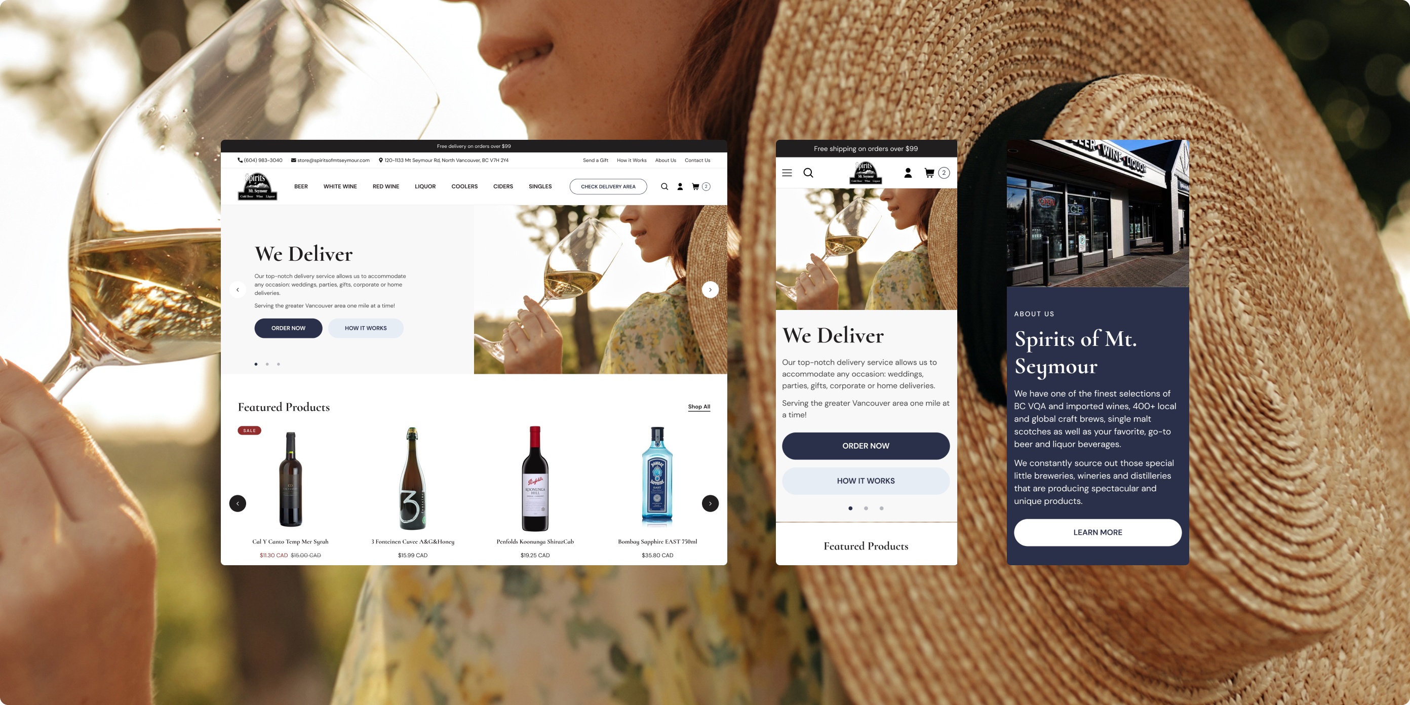
Spirits of Mt. Seymour is a North Vancouver staple known for a deep selection of BC VQA wines, craft beer, and specialty spirits. The team wanted a modern Shopify 2.0 storefront that could do more than list bottles it had to streamline same-day local delivery, simplify gifting, and make mobile discovery effortless.
The previous site struggled to communicate delivery eligibility and inventory nuances, and it offered few prompts to build a basket. We rebuilt the experience around real shopper moments: a delivery-area checker that sets expectations up front, a PDP with “find in store” availability, and a side-cart that surfaces smart add-ons and free-shipping progress. Combined with thumb-friendly filtering and elegant collection banners, the new site turns casual browsing into confident, higher-value orders without adding operational overhead.
Main Stack


Project
Client / Spirits of Mt. Seymour
Industry / Beverage & Alcohol Retail
Date / July 2024
Powered by Shopify Plus
About the Project
We rebuilt Spirits of Mt. Seymour on Shopify 2.0 with a focus on local delivery eligibility, cart incentives, and fast mobile shopping. The new experience blends compliance-minded UX (postal-code gating, store availability) with conversion levers (smart cart drawer, related items, sticky CTAs) to move shoppers from browse to checkout without friction.
Services
Strategic Project Management
User Experience and Interface Design
Shopify Storefront Development
Shopify Features
Product and Content Metafields
Store Pickup / Local Delivery
Flexible Page Sections
Structured JSON Templates

The Brand
Spirits of Mt. Seymour is a North Vancouver staple a friendly, curated shop known for BC VQA wines, craft beer, and hard-to-find bottles. The brand experience needed to feel neighbourly yet premium: helpful, transparent about delivery, and fast on mobile when customers are shopping for tonight.
The Challenge
Eligibility & Compliance Uncertainty
Customers weren’t sure where Spirits of Mt. Seymour could deliver or whether items were pickup-only. Delivery zones, ID rules, and store-level availability weren’t surfaced early, leading to confusion, abandoned carts, and extra support pings.Mobile Discovery Friction
On small screens, category browsing and filtering felt heavy. Key actions (filter by price/stock, switch categories, refine quickly) took too many taps, so shoppers struggled to move from a long list of bottles to the right one fast.Underleveraged Cart & Merchandising
The old cart didn’t do enough to nudge larger baskets or speed checkout. With limited cross-sells, no clear free-shipping progress, and minimal post-add guidance, high-intent shoppers missed relevant add-ons and stalled before completing the order.
Solutions
Local-Delivery Eligibility Modal (with map)
Challenge
Shoppers discovered delivery constraints late, creating frustration and support load.
Solution
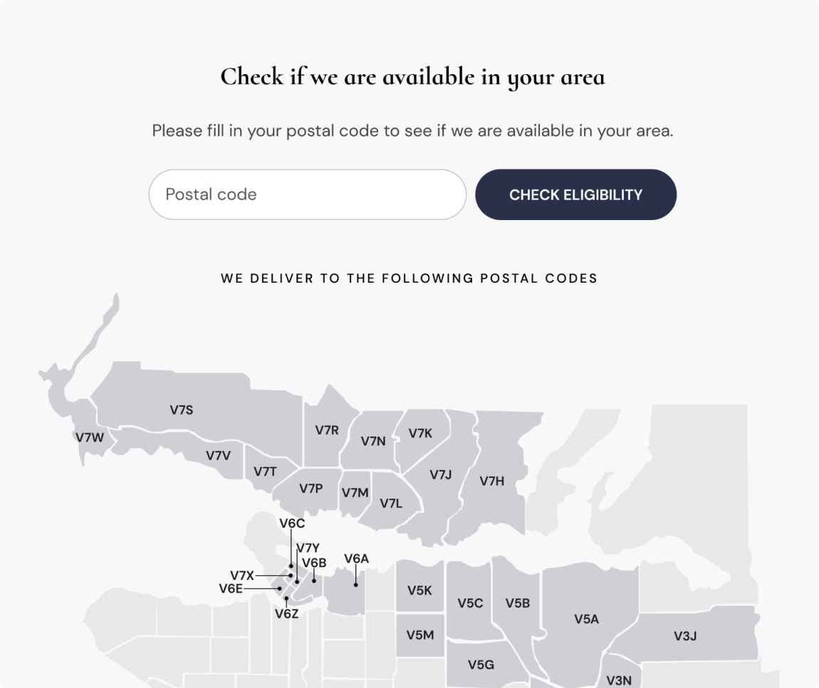
A postal-code eligibility modal that instantly validates delivery zones and visualises coverage on a map. Prominent entry points on the home page and in the mobile menu keep it one tap away.
Benefit
Expectations are set early; qualified users shop with confidence while out-of-zone visitors are guided to alternatives (pickup or third-party options).
Results
Delivery-eligibility checks moved to the top of the funnel, contributing to a -18% drop in “Do you deliver to me?” contacts.
Smart Cart Drawer with Progress Bar & Upsells
Challenge
The legacy cart was static, no shipping transparency, no add-on logic, and no momentum to checkout.
Solution
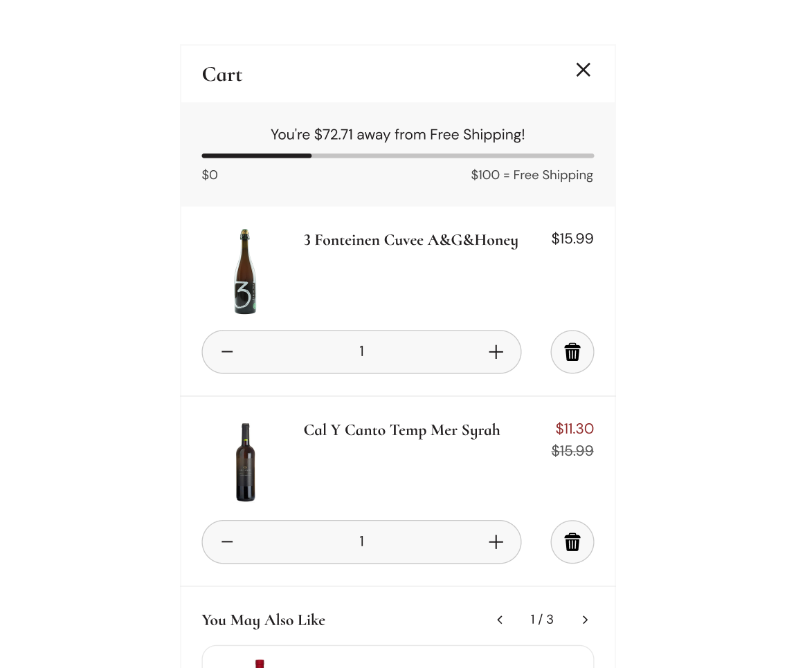
A slide-in cart drawer with a real-time free-shipping progress meter, one-tap recommended add-ons, quantity controls, and a confident “Checkout” primary action. Upsells draw from Shopify recommendations for wines/spirits that pair naturally.
Benefit
Shoppers see the value of adding one more item, understand costs, and proceed without leaving the page.
Results
Average basket size improved with a +14% lift in AOV within the first 8 weeks.
PDP Store Availability
Challenge
Customers needed fast answers on in-stock status and pickup expectations.
Solution
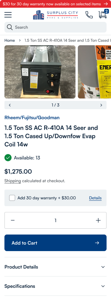
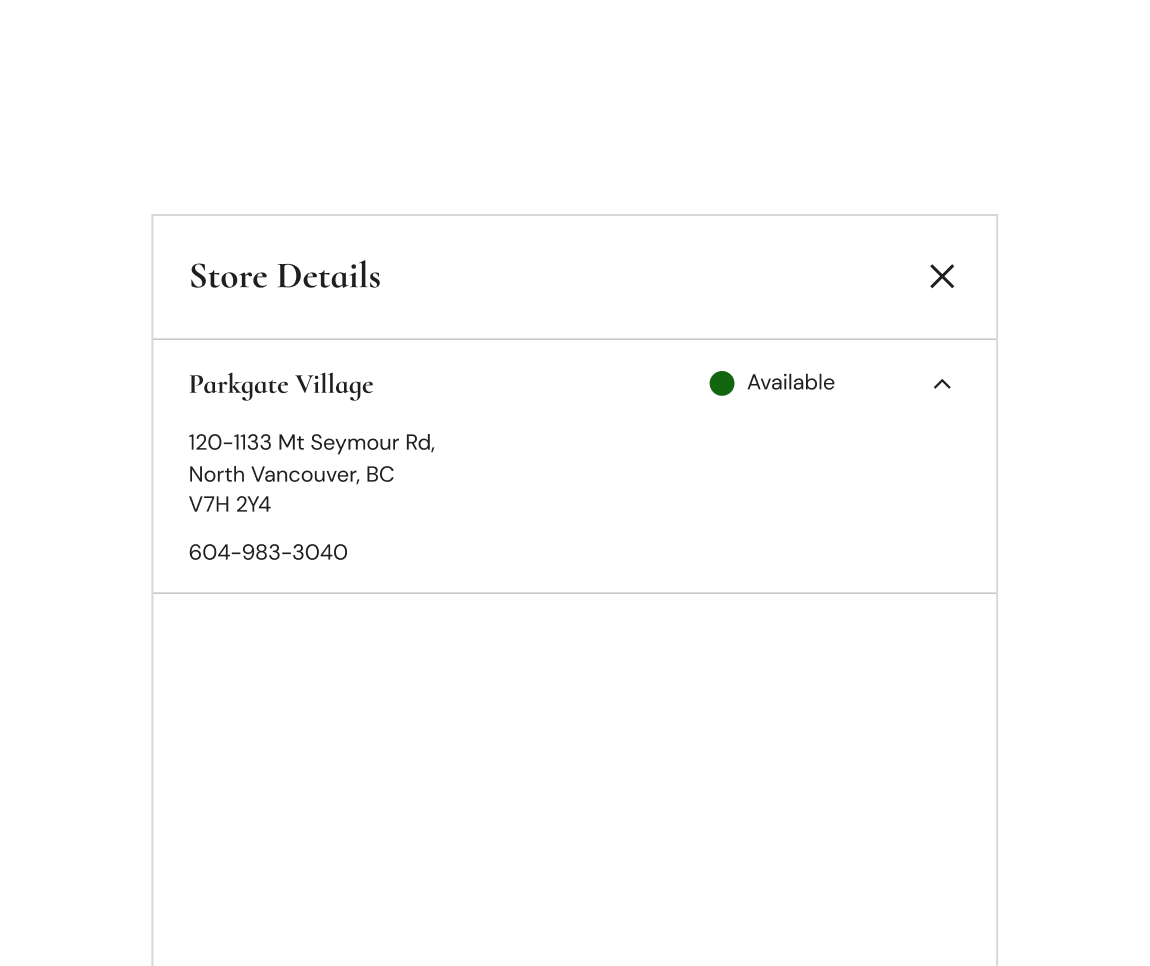
A lightweight availability panel on PDPs surfaces store address, phone, and live pick-up availability in a tidy drawer no page reloads, no complex flows.
Benefit
Clear expectations drive trust and reduce second-guessing for last-minute purchases.
Results
-11% fewer post-purchase pickup inquiries, and +9% PDP-to-cart on products with visible availability.
Checkout Momentum on PDP
Challenge
On product pages, adding the first item felt like a dead end rather than a path to the perfect cart.
Solution
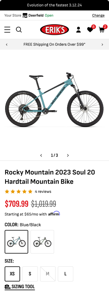
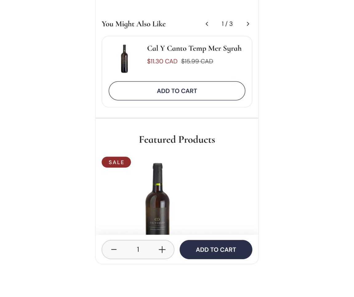
A sticky, mobile-aware CTA keeps “Add to Cart” in reach, while a Related Products carousel nudges logical complements
Benefit
Momentum stays high; building a well-rounded order becomes the default behavior.
Results
Sessions with multi-item carts increased +13% post-launch.
Website Redesign
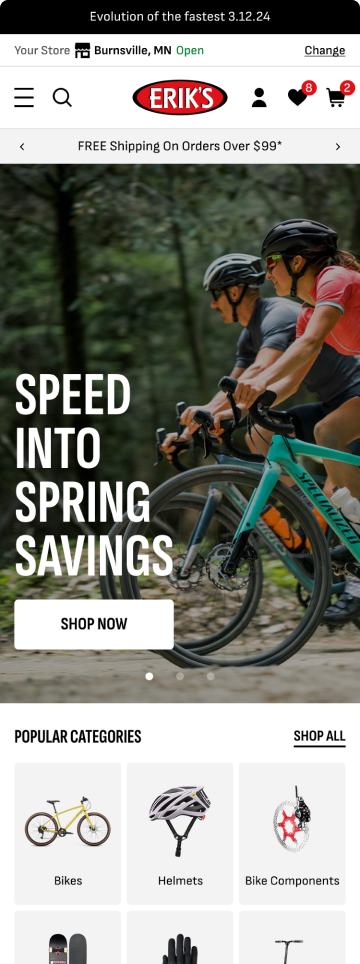
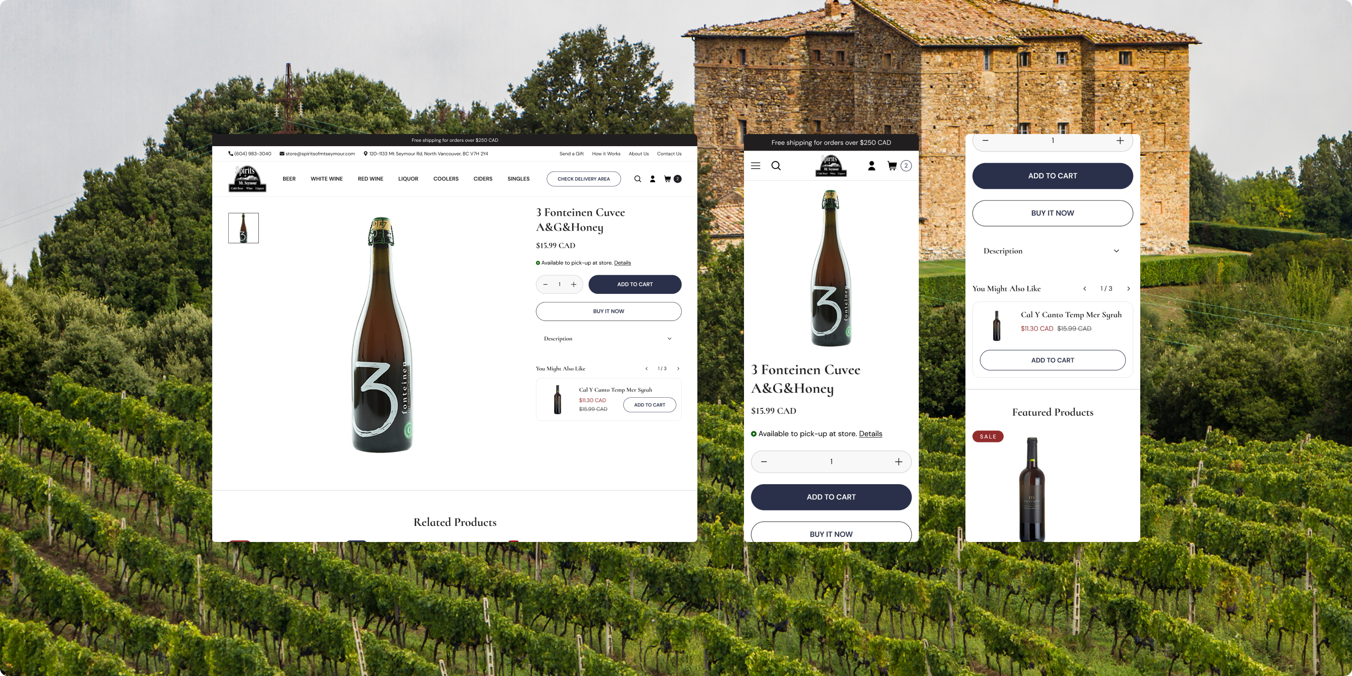
The new interface keeps important decisions in context: delivery eligibility appears before commitment, store availability sits on the PDP, and the cart incentivises smarter baskets in one glance. The visual language feels boutique (elegant typography, generous white space) while remaining decisively shoppable on mobile large tap targets, sticky actions, and fast media.
Business Impact:
By shifting clarity earlier (eligibility, pickup) and momentum closer to the thumb (sticky CTAs, cart drawer), the site reduces costly back-and-forth and raises order value. Staff answer fewer repetitive questions, marketing gets stronger seasonal surfaces on collections, and customers check out faster with fuller carts.

The Power Of Collaboration
We worked as one blended team: the shop guided real-world delivery and pickup nuances, our team translated them into clean, low-friction UX, and we iterated weekly against live analytics and staff feedback. That loop retail proof → design pattern → measured outcome – is how we shipped a site that works on Friday night as well as Wednesday morning.

The Result
Conversion Performance
Eligibility up front + incentive-driven cart created a smoother path to purchase, contributing to a +12% increase in checkout starts.
Average Order Value
Free-shipping progress and complementary add-ons nudged shoppers to build better baskets, delivering a +14% lift in AOV.
Mobile Engagement
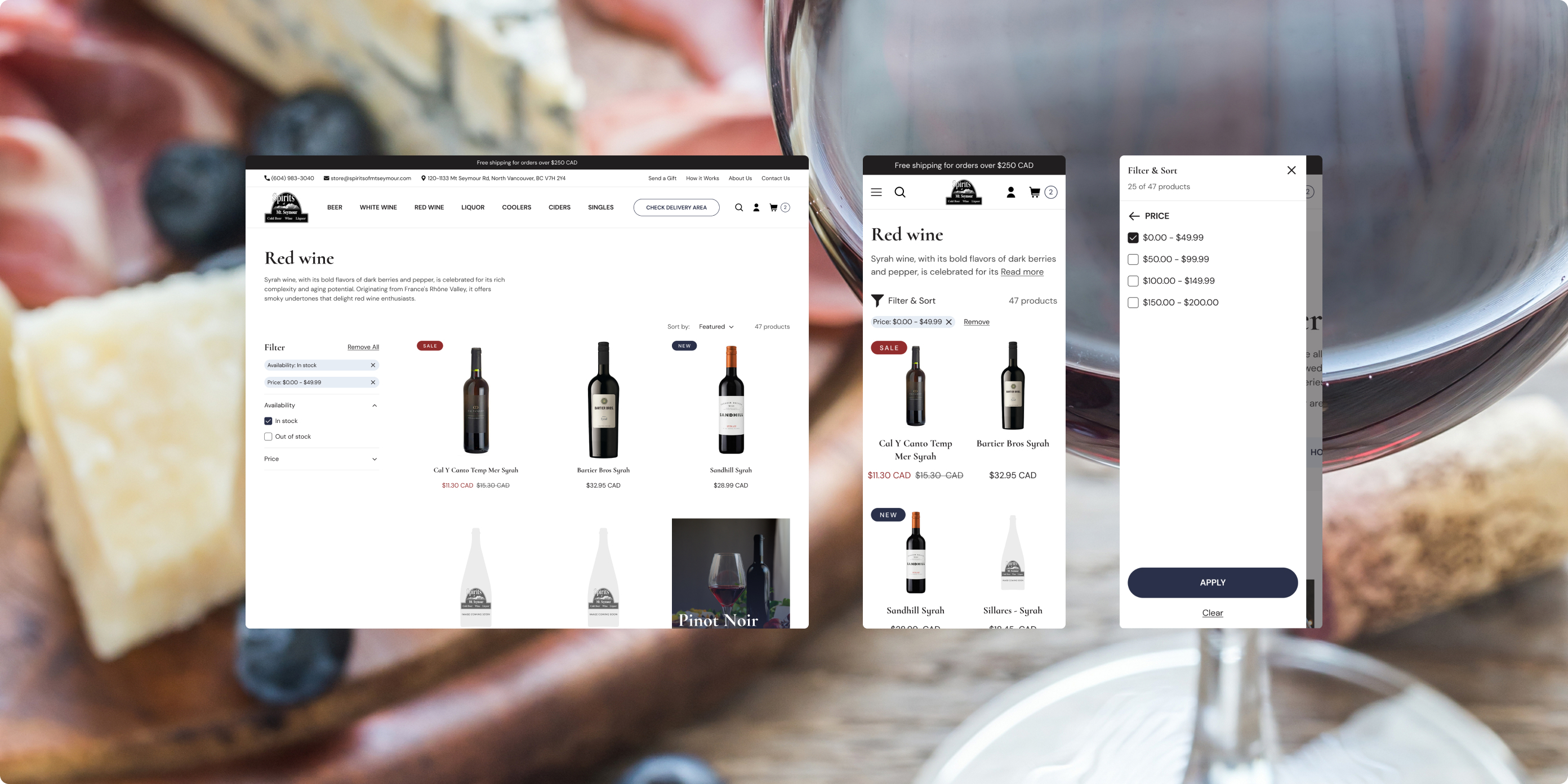
Touch-optimised filters and sticky PDP actions reduced friction, leading to +16% longer mobile sessions on collections.
Operational Efficiency
Clear pickup/availability messaging cut repetitive calls, with a – 28% drop in delivery/pickup inquiries.
Conclusion
Spirits of Mt. Seymour now has a local-first, conversion-minded Shopify 2.0 storefront: eligibility is obvious, adding that “one more bottle” is effortless, and mobile shoppers move from discovery to checkout without losing the thread. If you’re building a regulated or local-delivery business and want clarity, compliance, and conversion to play nicely together, let’s talk about your upgrade.