

Plenty
A luxury fashion Shopify 2.0 upgrade blending editorial polish with ecommerce performance
Closet Clean-Out, Site Edition
Plenty has been bringing effortless West Coast style to Canadian shoppers for years. After launching their Shopify store in 2021, the brand continued to grow, and it was time for the website to reflect where they were headed.
This redesign focused on refining the shopping experience without losing what customers already loved. From stronger visual storytelling to improved merchandising and a smoother mobile experience, every update was designed to make the site feel as polished as the brand itself.
Main Stack


Project
Client / Plenty
Industry / Fashion & Lifestyle Retail
Powered by Shopify Plus
About the Project
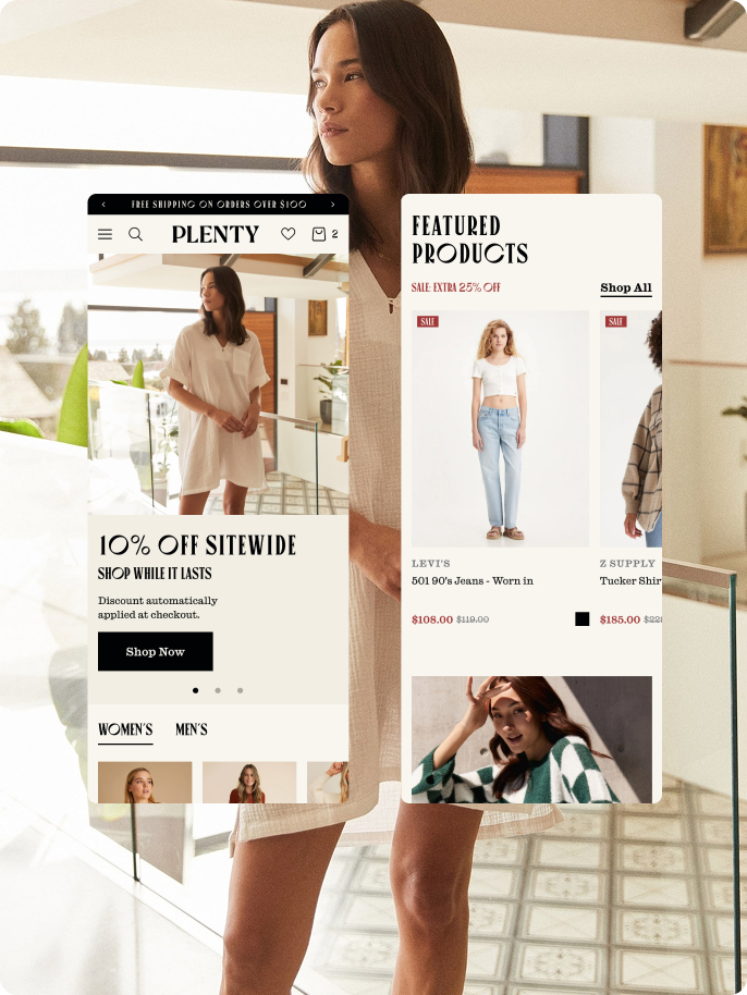
We redesigned Plenty’s ecommerce experience with a more style-conscious customer in mind. The new site combines clean, elevated visuals with fast, intuitive mobile performance, and merchandising that’s built to drive sales. The result is a Shopify 2.0 storefront that tells the brand’s story more clearly while making it easier for customers to shop.
Services
Project Management
UI/UX Design
Full Shopify Development
Ecommerce Website Integrations
Shopify Features
Metafields
Dynamic Sections
JSON Templates
Cart Customization
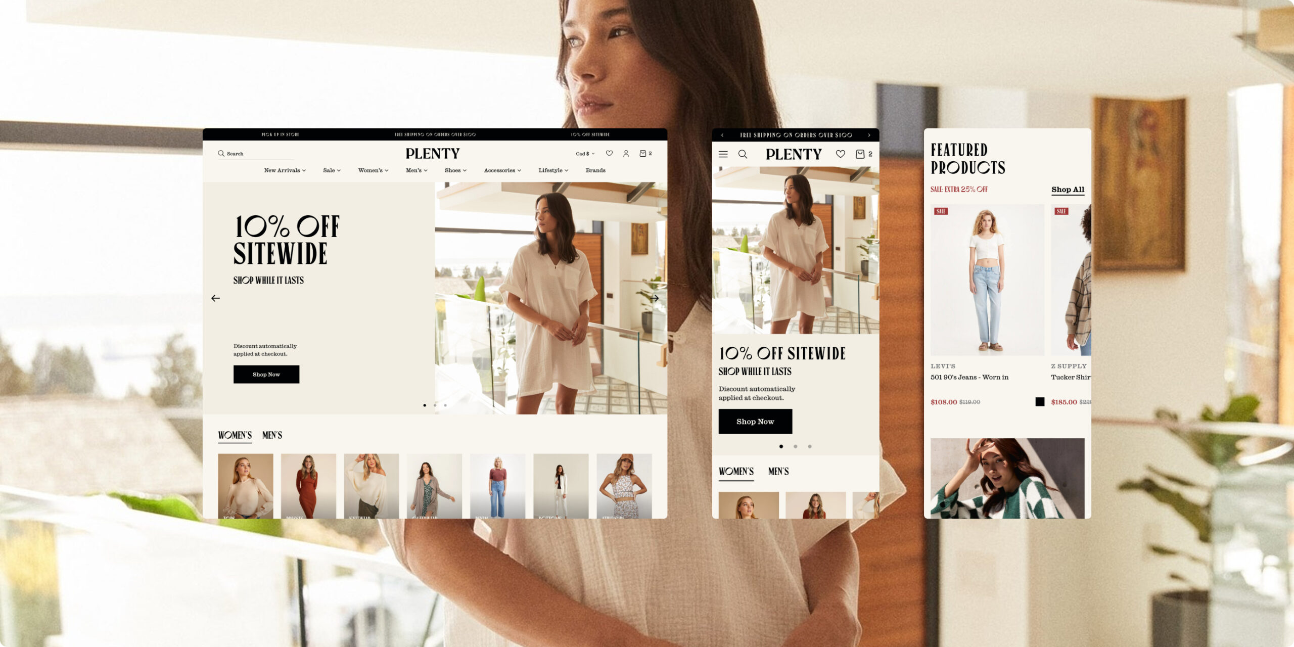
Where Great Style Starts
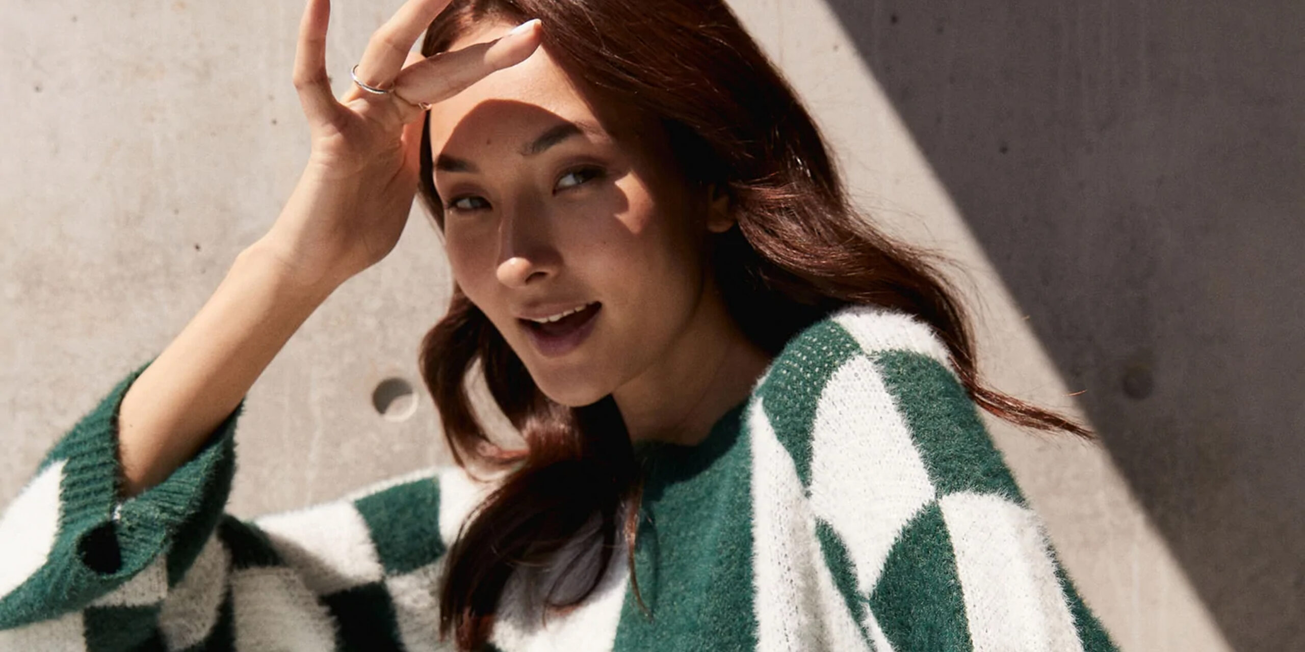
Plenty isn’t about chasing trends. It’s about finding the pieces people reach for every day. With stores across British Columbia and an online shop to match, the brand has built a loyal following by curating clothing that feels effortless, wearable, and distinctly West Coast.
The Challenge
Because we built Plenty’s original Shopify store, we already knew what was working and where the site was starting to show its age. This wasn’t about starting over. It was about refining the experience, making products easier to discover, giving collections more personality, and bringing the website in line with how the brand had evolved.
Limited flexibility across the site
The existing theme made it tough for the team to move quickly. Launching campaigns, rearranging content, or building out seasonal stories often required developer support, which slowed things down.An outdated visual system
The interface was starting to feel dated, and inconsistencies in how imagery was handled took away from the brand’s more polished, editorial feel.Mobile experience falling short
Key interactions on mobile, like tapping, browsing galleries, and navigating pages, were not as smooth as they needed to be, making it harder for customers to explore and shop.- Merchandising limitations
The platform did not fully support things like bundles, styled looks, or richer product detail content, which meant missed opportunities to cross sell and better tell the product story.
The Fashion Fix
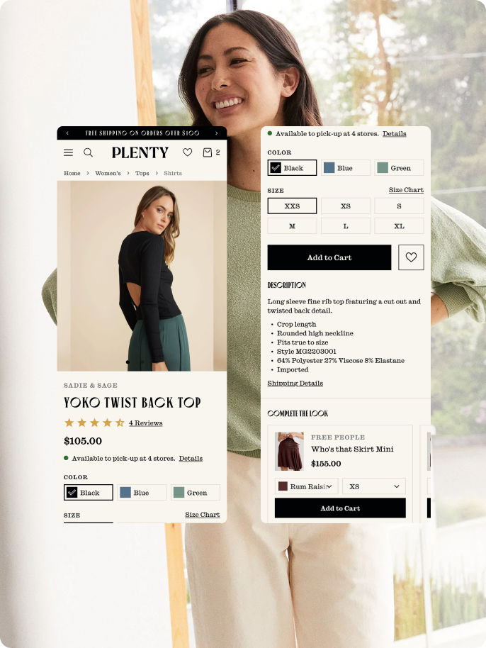
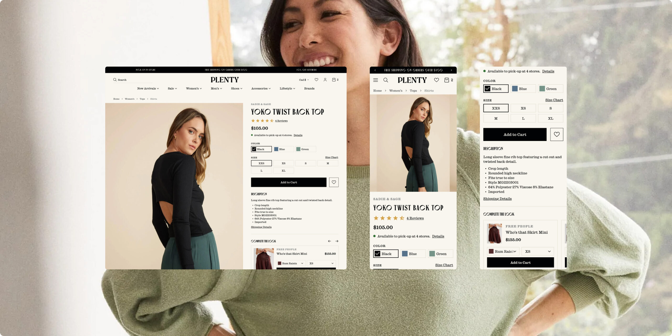
Product Pages That Work Harder
Challenge
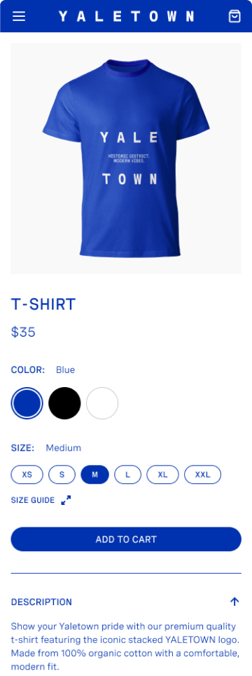
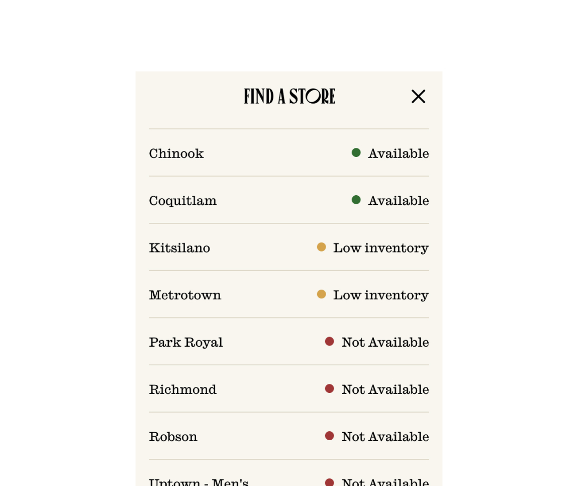
The existing PDPs were pretty limited in how they could be structured and didn’t give enough room to properly support merchandising, styling, or key fulfillment details.
Solution
We reworked the PDP to better support storytelling at the product level, adding style recommendations, surfacing reviews more clearly, and making pickup and shipping info easier to find.
Benefit
The new layout gives customers the context they need, from fit to availability to styling, so they can shop with more confidence.
Results
We saw stronger engagement overall, with more time spent on product pages and improved conversion across key categories.
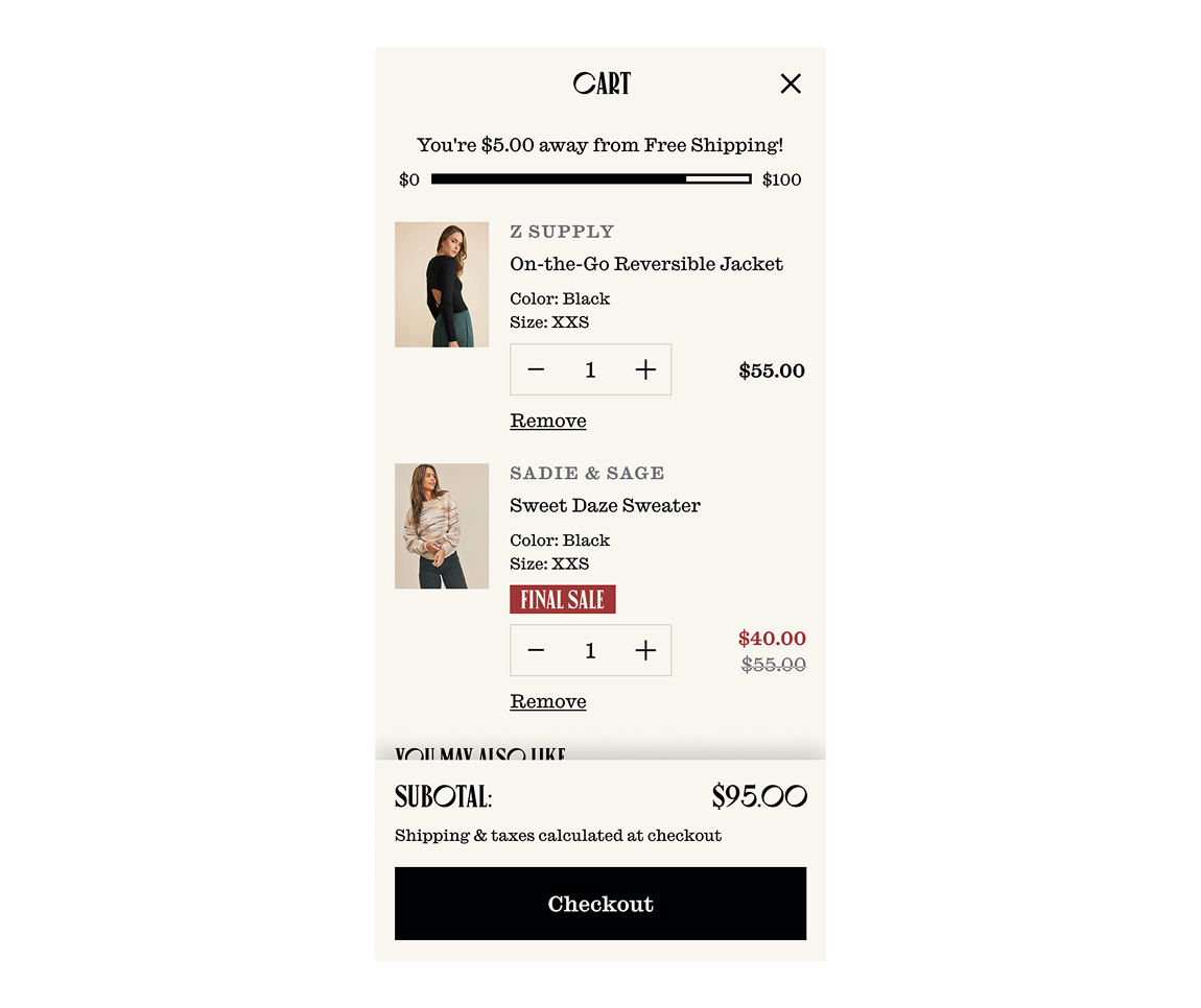
A Smarter Cart Experience
Challenge
The original cart did its job, but that was about it. It gave customers a place to review their order, without offering much reason to keep shopping or discover related products.
Solution
We introduced a slide in cart that updates in real time, with clear order totals, a free shipping progress indicator, and product recommendations pulled in natively through Shopify.
Benefit
The new cart keeps customers engaged and makes it easier to keep shopping without disrupting the flow to checkout.
Results
We saw an increase in average order value along with stronger cart engagement, creating a smoother and more effective path to purchase.
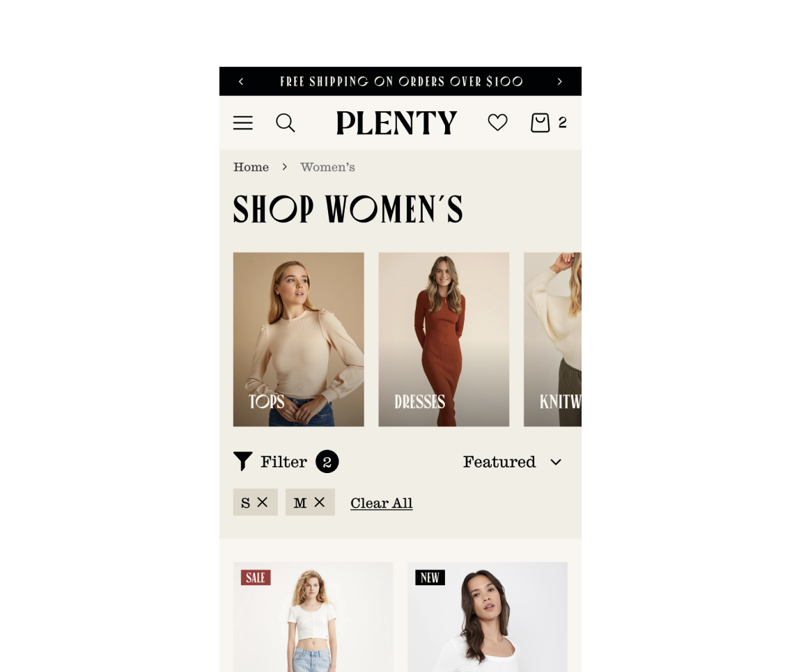
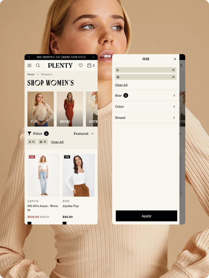
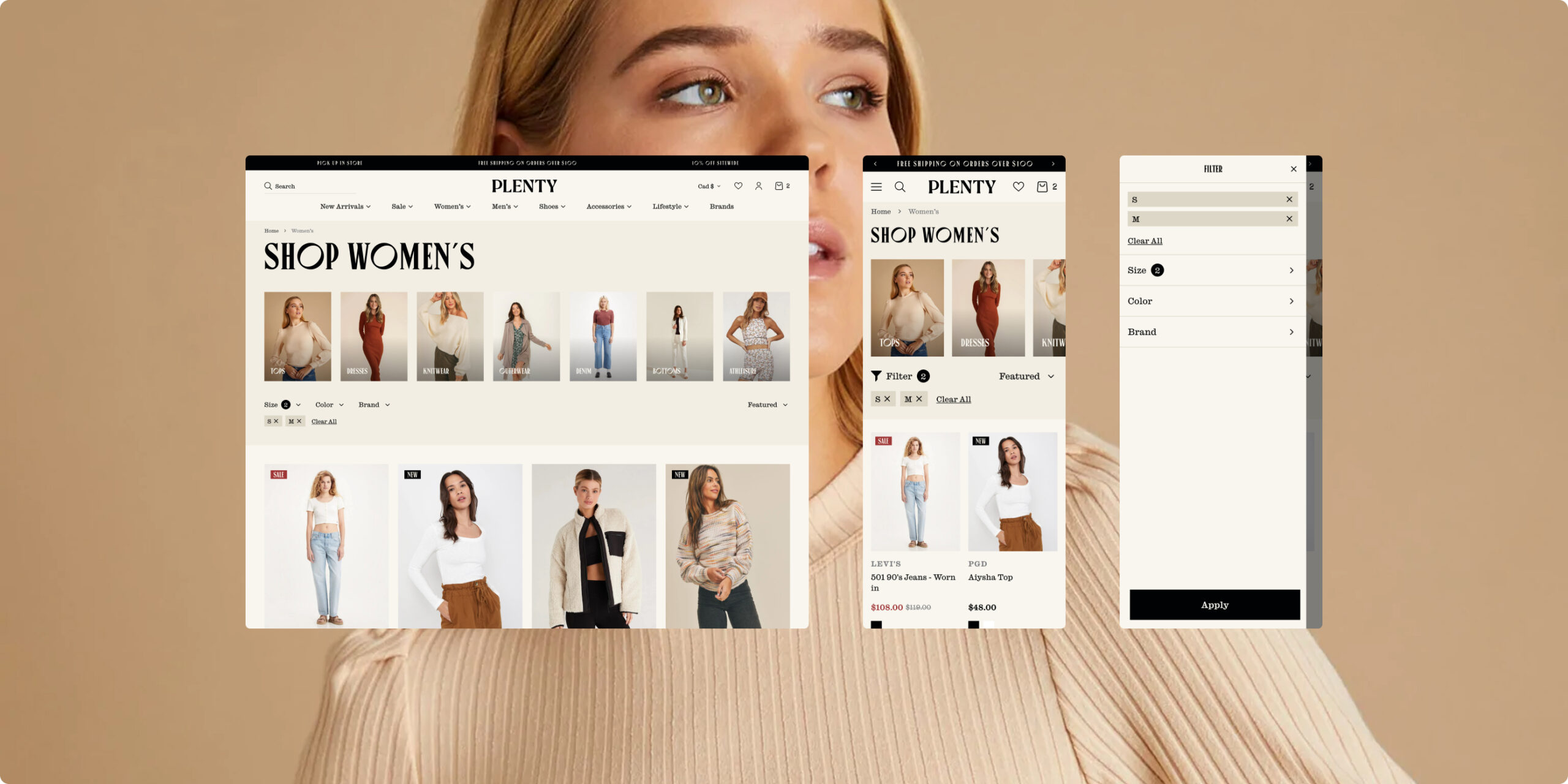
Mobile Optimized Collection Navigation
Challenge
Browsing larger collections on mobile was frustrating. It was hard for customers to filter, scan, and find what they were looking for without a lot of effort.
Solution
We reworked the collection experience for mobile, introducing clearer filtering, easier ways to toggle options, and headers that stay in place as you scroll.
Benefit
The new setup makes it much easier to browse and narrow things down, especially on smaller screens.
Results
Customers are able to move through collections more quickly, with less friction and fatigue, leading to a smoother overall browsing experience.
Website Redesign
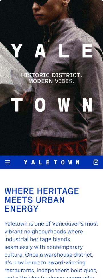
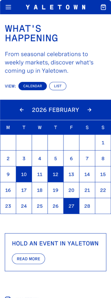
The redesign brought Plenty’s brand to life in a more editorial, content-led way. On mobile, the experience feels faster and easier to navigate, while on desktop there’s more room for richer merchandising and clearer product storytelling.
Business Impact:
The update led to meaningful improvements across the board. A more thoughtful cart experience, stronger upsell opportunities, and improved navigation all helped customers find products faster and spend more time engaging with them. Overall, the site feels more in line with a modern, premium retail experience.
The Power Of Collaboration
Plenty brought a clear point of view and a collaborative mindset from the start, which made the whole process feel easy to move through. Communication was straightforward, decisions were thoughtful, and there was a shared focus on getting things right instead of rushing. That level of trust early on made it easier to explore ideas and push the work further. The end result really reflects that kind of steady, collaborative approach.
The Result
Making Checkout Feel Easier
The updated product pages and slide in cart worked together to make shopping feel more natural. Customers could find what they needed, add to their cart, and check out without unnecessary steps or distractions.
A Cart That Keeps Shopping Going
Instead of sending customers straight to checkout, the new slide in cart made it easy to keep browsing, discover complementary products, and add another item without breaking their flow.
Built for Smaller Screens
The mobile experience was reworked to make browsing feel effortless. Customers could move between collections, explore products, and shop without the friction that often comes with smaller screens.
Refined From Top to Bottom
The refresh wasn’t about reinventing the brand. It was about making the online experience feel more like walking into one of Plenty’s stores. Better merchandising, stronger product pages, and a more thoughtful mobile experience all came together to create a site that feels familiar to existing customers and welcoming to new ones.