


DIY SePRO
A Shopify 2.0 Overhaul That Simplifies Pond Care for All: Reimagining DIY SePRO’s DTC Experience
Pond Problems, Solved
DIY SePRO, the direct to consumer arm of a leading aquatic solutions company, came to us ready for more than a visual update. Their existing nopCommerce site was hard to navigate, content heavy, and not built to support how customers actually research and solve pond issues.
We migrated the site to Shopify 2.0 and rethought the experience from the ground up. The focus was on making information easier to understand and act on, with a more guided approach to product discovery. This included education led design, diagnostic tools, interactive calculators, and a simpler path to purchase.
The result is a site that feels far more approachable, helping homeowners understand what they need and move forward with confidence.
Main Stack


Project
Client / DIY SePRO
Industry / Aquatic Management Solutions
Powered by Shopify Plus
About the Project
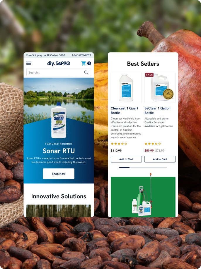
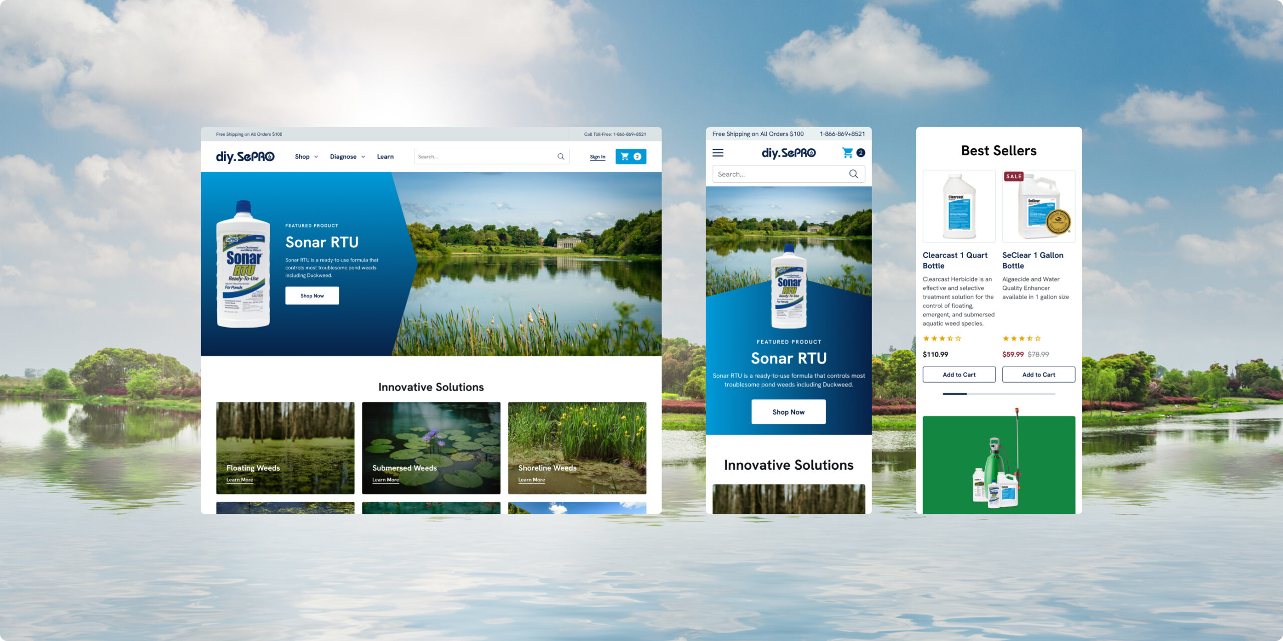
We reworked DIY SePRO’s ecommerce experience, migrating from nopCommerce to Shopify 2.0 and rebuilding the site around clarity and usability. With custom tools and a simplified interface, the new platform makes it easier for DIY pond owners to find what they need and take action.
Services
Project Management
UI/UX Design
Full Shopify Development
Ecommerce Website Integrations
Shopify Features
Dynamic Sections
Metafields
Custom Liquid Logic
Flexible Content Blocks
The Brand
DIY SePRO is the direct to consumer arm of SePRO Corporation, a U.S. based leader in aquatic management. The brand focuses on providing tools and treatments for pond and lake care, built for everyday use.
Most customers are not experts. They are homeowners, property managers, or landowners looking to maintain healthy water without a deep technical background. The goal is to make pond care more approachable, without losing the credibility behind the products.
The Challenge
DIY SePRO had strong product expertise, but the site was making it harder for customers to use it. Most visitors were not experts, and the experience did not do enough to guide them through what can be a pretty technical category.
Hard to navigate the buying journey
Customers often struggled to diagnose their issue and find the right product without outside help.Low confidence at the product level
Product pages were heavy on technical language, with little visual support or clear guidance.An outdated interface
The design lacked clarity and did not hold up to modern ecommerce expectations, especially on mobile.- No supporting tools
Customers had to figure out things like product quantity and coverage on their own. - Missed opportunity for content and SEO
There was valuable educational content, but it was buried and not connected to the shopping experience.
Main Work And Key Functions
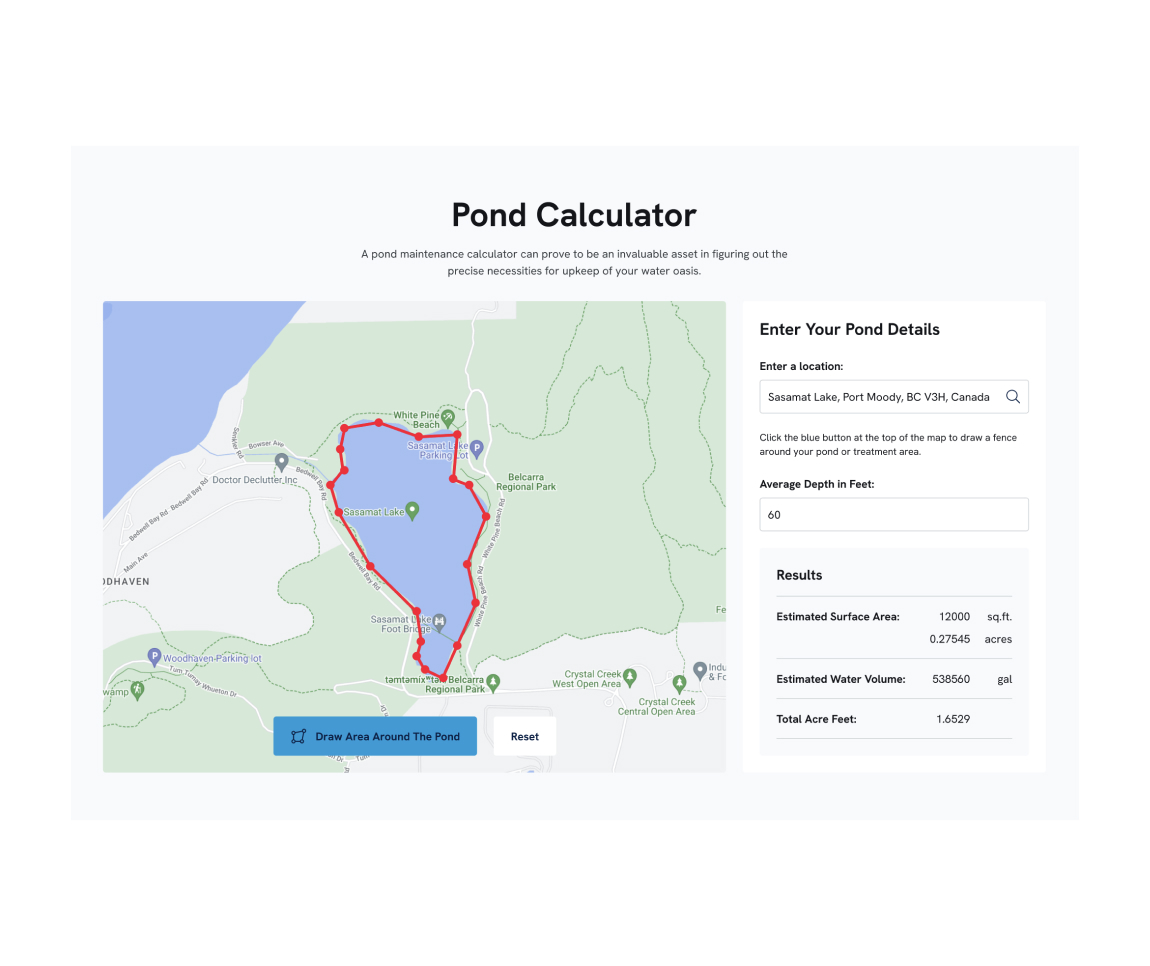
Pond Calculator with Google Maps Integration
Challenge
Customers often had a hard time figuring out the size of their pond and how much product they actually needed.
Solution
We built a custom pond calculator using Google Maps, allowing users to map out their pond and enter basic details like depth to get more accurate estimates.
Benefit
It takes the guesswork out of the process, helping customers feel more confident in what they are buying.
Results
Fewer support questions and a smoother path to purchase.
Three-Tier Diagnosis Flow
Challenge
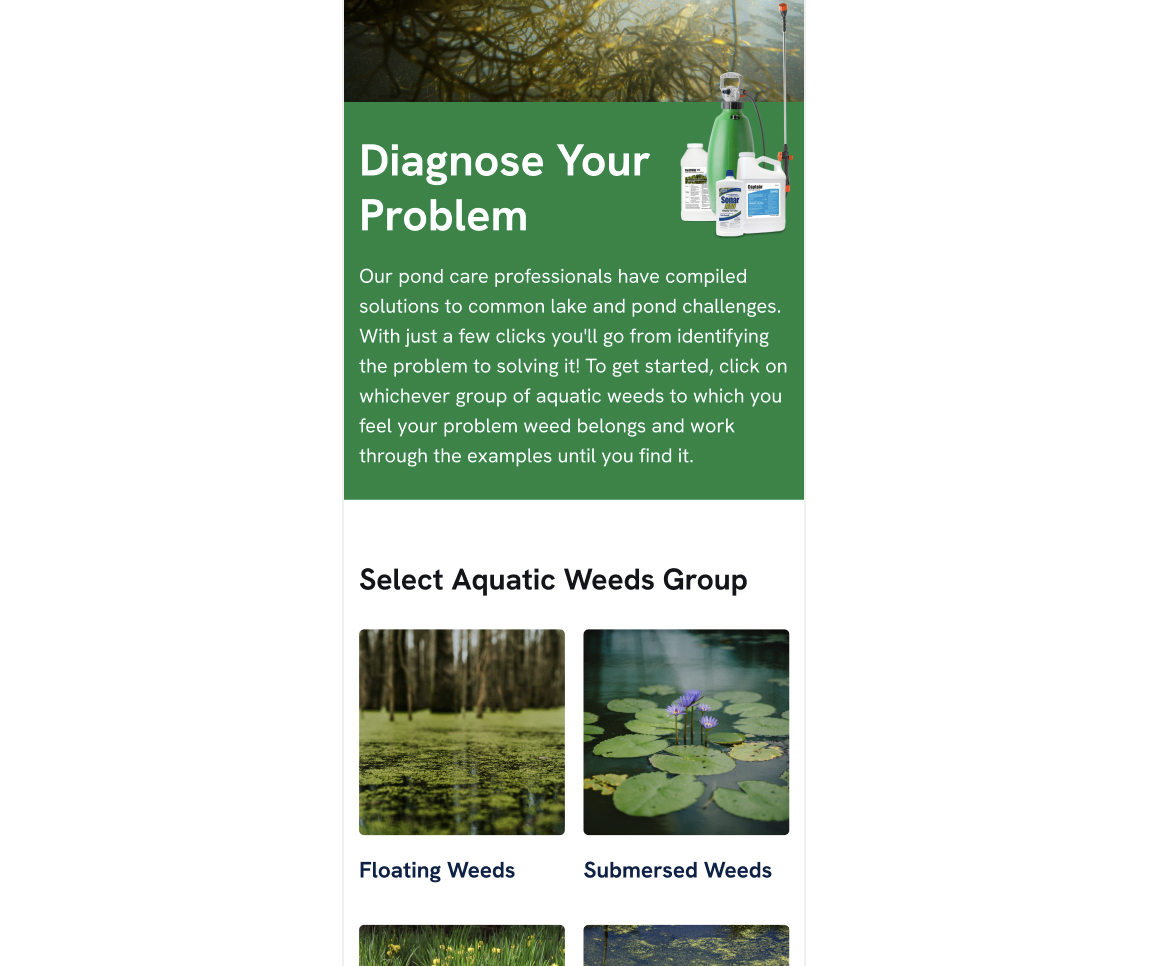
Most customers did not know exactly what type of pond weeds or algae they were dealing with, making it difficult to choose the right treatment.
Solution
We created a simple, step by step diagnostic flow that helps users identify common pond issues. Starting with plant type, then visual matching, and ending with a recommended treatment, the experience guides customers from problem to solution.
Benefit
It removes uncertainty and helps customers feel more confident choosing the right pond care products.
Results
More customers are able to identify their issue and move directly to the right product without needing outside support.
Modular PDP Content System
Challenge
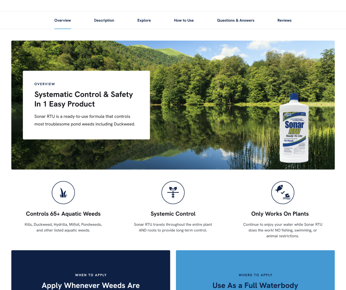
Product pages were dense and difficult to navigate, especially for customers trying to understand how to use pond treatment products or choose the right solution.
Solution
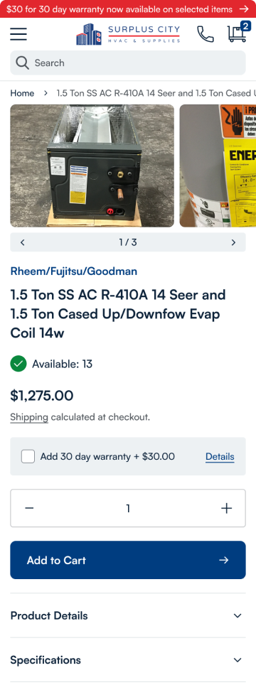
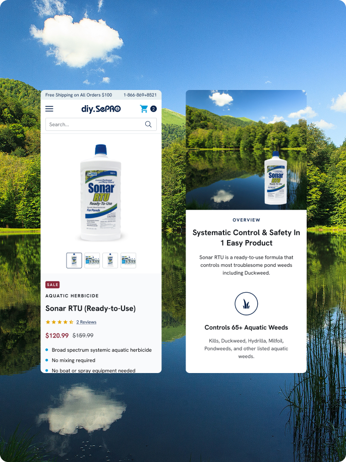
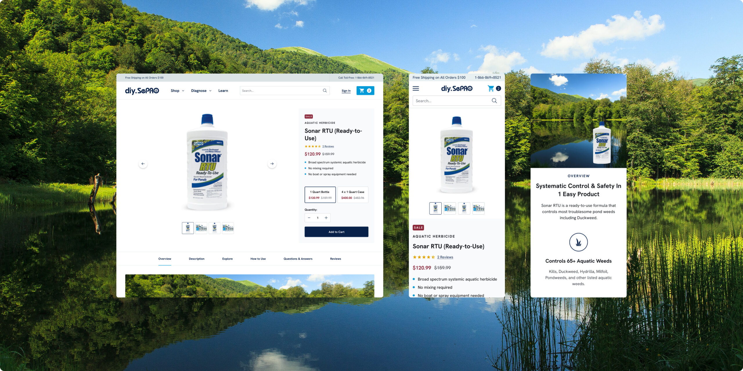
We introduced a modular content system on PDPs, using expandable sections like Overview, Explore, How to Use, FAQ, and Reviews. Each module adapts based on the product, making it easier to present the right information without overwhelming the page.
Benefit
Customers can quickly find what they need, whether they are learning about pond care, comparing products, or looking for application guidance. The experience feels more structured and easier to move through, especially on mobile.
Results
Product pages are easier to scan and understand, helping customers make decisions faster and with more confidence.
Getting to the Bottom of It
We approached the design with one goal in mind: make complex pond care easier to understand and act on. Instead of overwhelming users with technical content, we focused on guiding them through the process, from diagnosing a problem to choosing the right treatment.
Key improvements like the diagnosis flow, pond calculator, and modular product content all work together to support that journey. Each part of the site is designed to answer a specific question, helping users move forward without second guessing.
Mobile usability was a major focus. Layouts were simplified, content was easier to scan, and key actions stay accessible throughout the experience. Performance improvements also played a role, with faster load times and a smoother overall flow.
The Power Of Collaboration
We worked closely with SePRO’s internal marketing and product education teams throughout the project. Their expertise was key in making sure everything was accurate and aligned with regulatory standards, while still being easy for everyday customers to understand.
There was a steady back and forth as we built and tested tools like the diagnosis flow and pond calculator, making sure they were both useful and easy to use. That collaboration helped translate a very technical product set into an experience that feels clear and approachable for homeowners.
The Result
Diagnosis Experience
More customers are able to work through their pond issues on their own, using guided flows to identify the right solution.
Product Page Performance
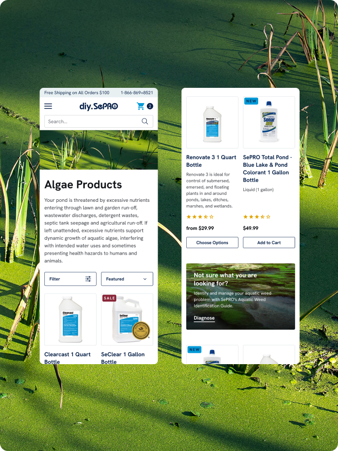
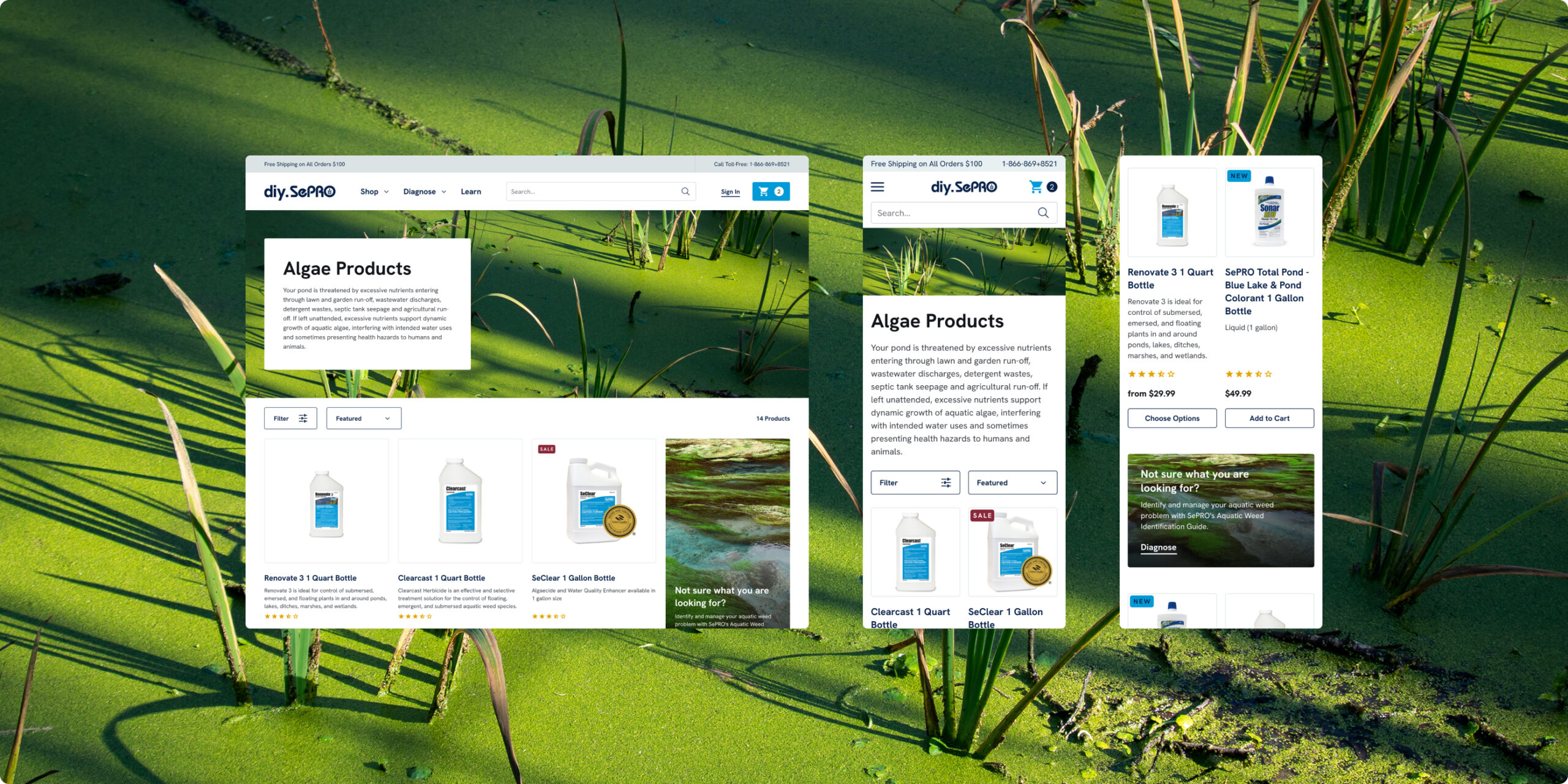
Clearer layouts and modular content make it easier to understand products and take action.
Mobile Checkout
Improved calls to action and a more streamlined experience help customers move more easily from browsing to checkout on mobile.
Customer Support
Tools like the pond calculator and guided diagnosis reduce confusion and cut down on product related questions.
The Conclusion
This was more than a redesign. DIY SePRO moved from a hard to navigate, content heavy nopCommerce site to a Shopify 2.0 experience built around clarity and usability.
By introducing guided tools like the diagnosis flow and pond calculator, along with more structured product pages, the site now helps customers understand their problem and take action without feeling overwhelmed.
The result is a more approachable, practical experience that supports both education and commerce, making it easier for customers to find the right solution and move forward with confidence.