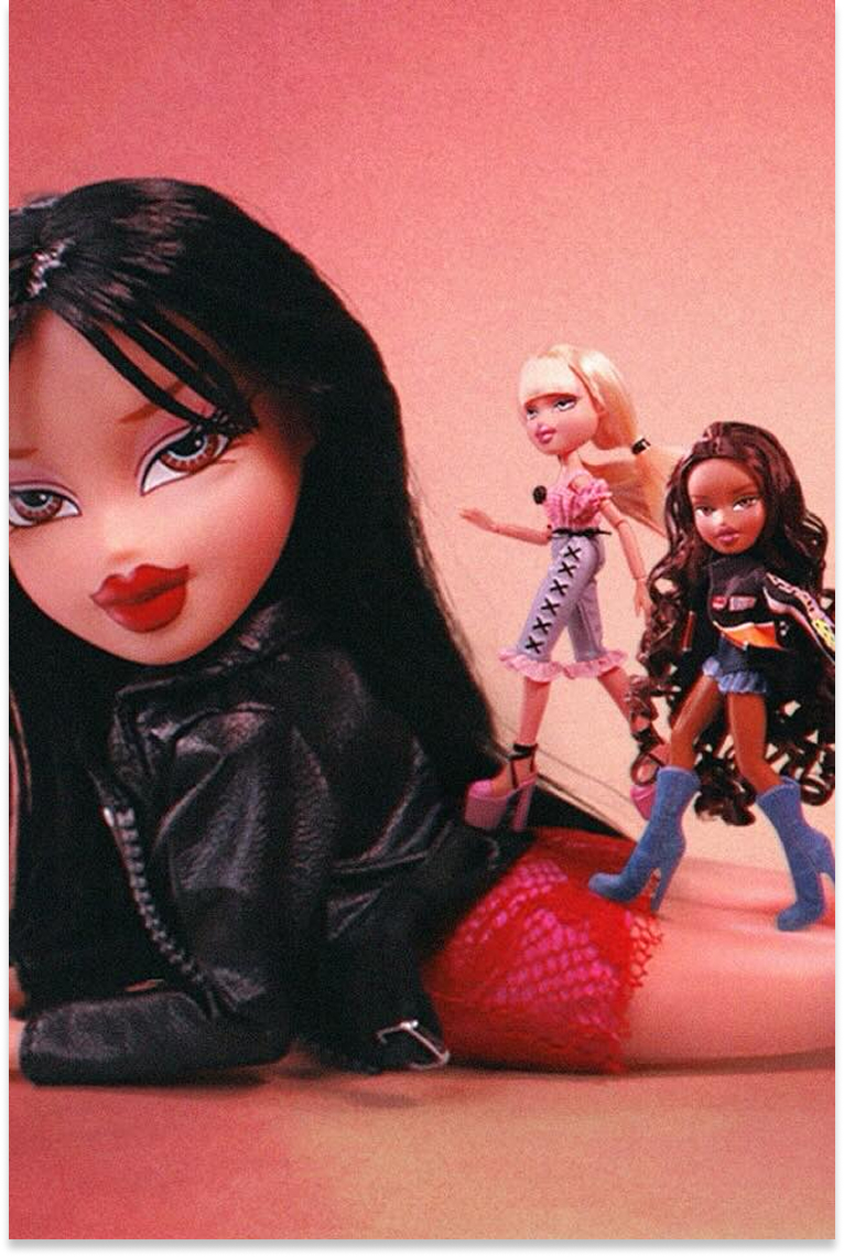



Bratz
Where Iconic Nostalgia Meets High Performance Commerce
Bold Brand. Smart Store.
Bratz is more than a toy brand. It is a cultural icon with a fearless identity and a loyal following. This project was a complete redesign and rebuild of a mobile first Shopify 2.0 experience that captures the brand’s bold personality while supporting its evolving retail strategy. With strong storytelling, a visually rich product experience, and a focus on conversion, we delivered a direct to consumer platform that performs as confidently as it looks.
Main Stack


Project
Client / Bratz
Industry / Toys & Entertainment
Powered by Shopify Plus
About the Project
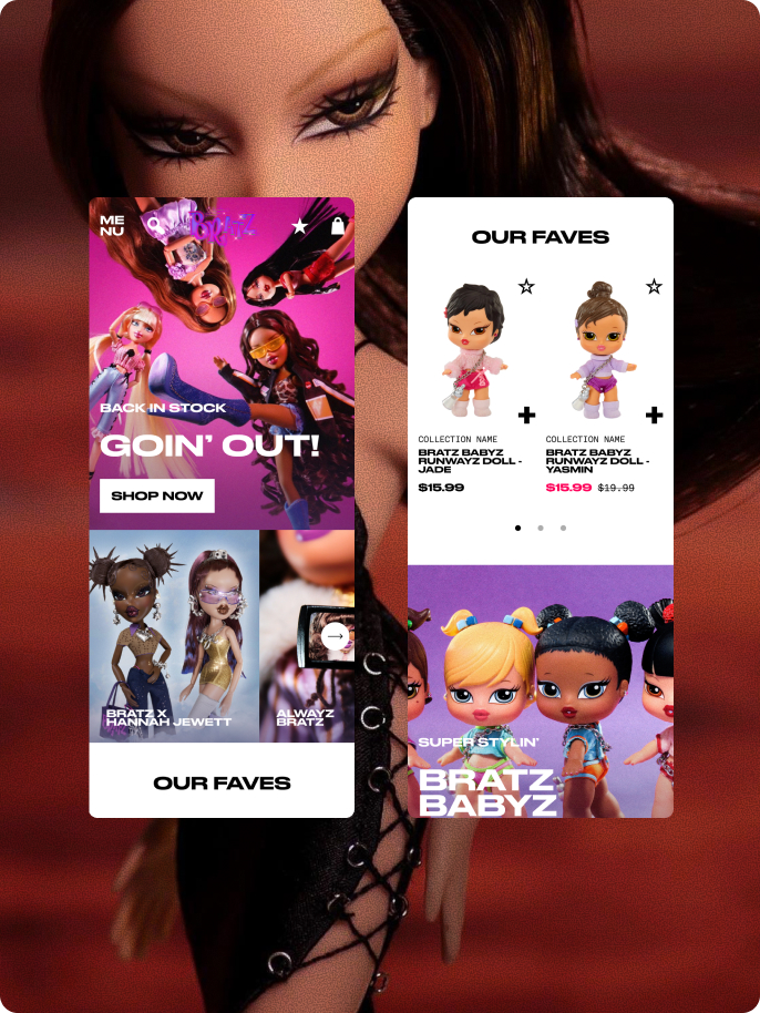
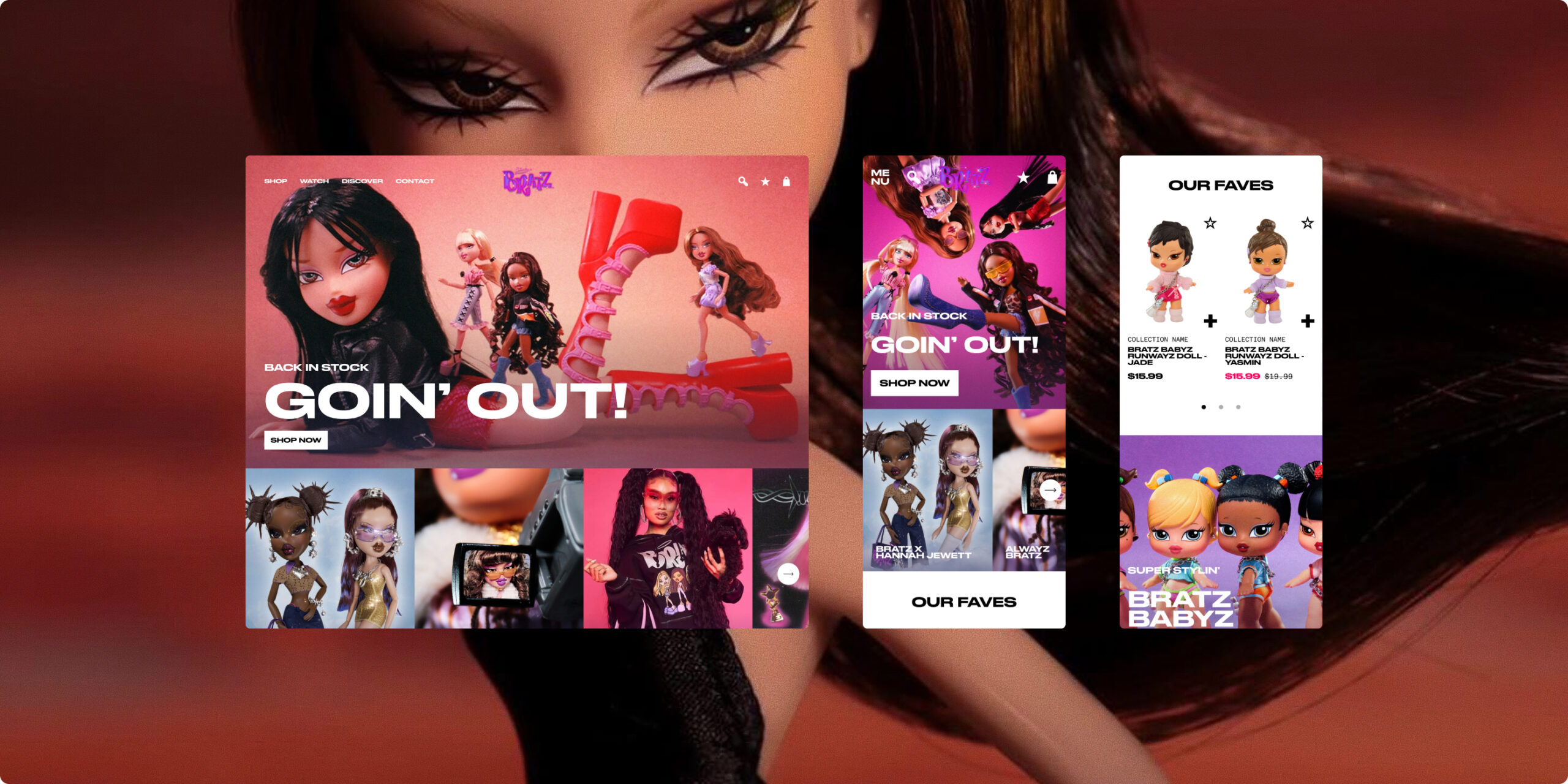
Bratz partnered with our team to transform their ecommerce presence into an experience as vibrant and confident as the brand itself. We created a fully custom Shopify 2.0 storefront designed for Gen Z audiences, devoted collectors, and a digital native fanbase.
Services
Project Management
Ecommerce Website Integrations
Shopify Features
Sticky Add-to-Cart Bar
Smart Upsell Modal
Dynamic Side Cart
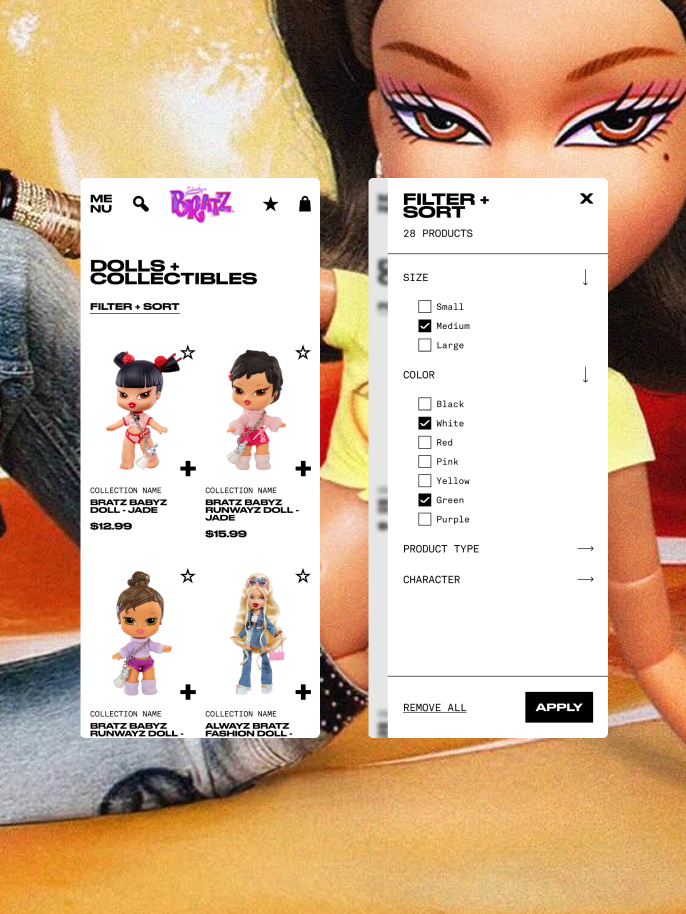
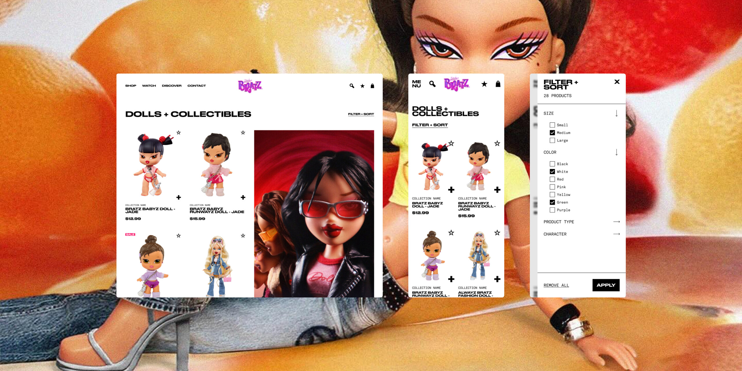
Advanced Collection Filtering
Predictive Search, and more.
The Brand
Bratz, part of the MGA Entertainment portfolio, is a global fashion doll phenomenon with a loyal and diverse fanbase spanning generations. Celebrated for its bold personalities, glam-forward style, and lasting impact on pop culture, Bratz connects with Gen Z trendsetters, nostalgic collectors, and new fans discovering the brand’s fearless attitude for the first time.
The Challenge
Bratz was ready for something bigger. The brand had outgrown its existing storefront and needed more than just a visual refresh. This was about performance as much as design.
The site did not have the flexibility to tell stories, the structure to support growth, or the features expected by today’s shoppers. The goal was to create an experience that could do more across the board, support stronger merchandising, encourage discovery, and keep up with how people actually shop.
Limited flexibility for content
The previous theme made it hard to curate the homepage, build campaigns, or tell a strong visual story.Basic product merchandising
There was little room for upsells, bundles, or personalization, just standard product listings.A weak cart and checkout experience
The flow was missing key elements, like a mini cart, progress indicators, and meaningful incentives to increase order value.- Inconsistent visual experience
The design lacked cohesion across the site, from product pages through to checkout. - Poor mobile optimization
On mobile, the experience felt slow and clunky, making it harder for customers to browse and convert.
All Sass, All Systems Go
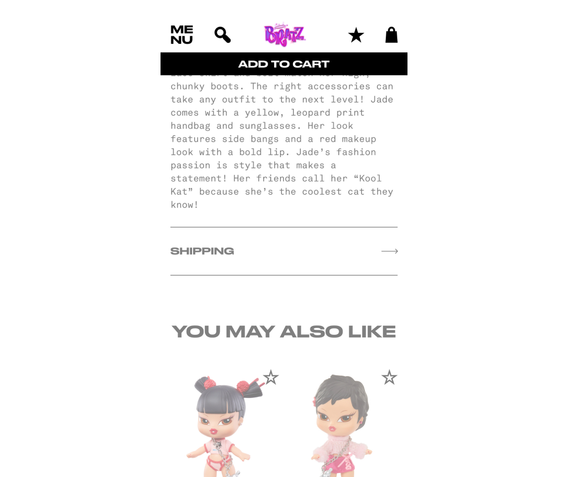
Sticky Add to Cart on PDP
Challenge
Customers had to scroll through a lot of content before they could add a product to cart, which made the experience slower, especially on mobile.
Solution
We introduced a sticky add to cart bar on product pages, including variant selection so customers can take action at any point.
Benefit
The primary action stays visible, making it easier for customers to move forward without breaking their flow.
Results
Fewer drop offs and stronger add to cart activity, particularly on mobile.
Side Cart With Free Shipping Indicator
Challenge
The checkout experience felt disconnected and did not do much to encourage customers to keep going.
Solution
We introduced a dynamic side cart with a clear progress indicator toward free shipping, giving customers a reason to add more before checking out.
Benefit
The cart feels more present and useful, encouraging customers to engage with it instead of skipping straight to checkout.
Results
Customers add more to their carts and move through checkout with less friction.
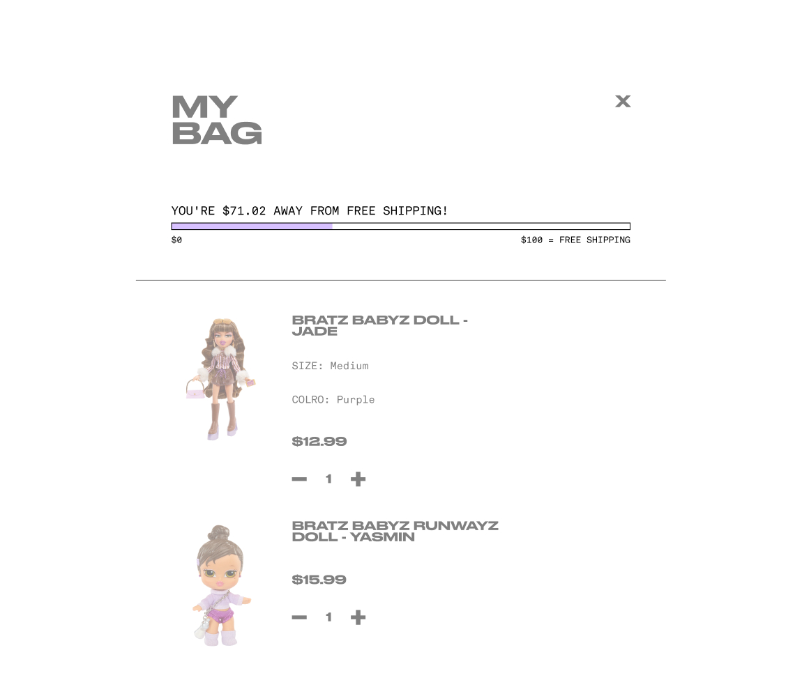
Upsell Modal on Add-to-Cart
Challenge
There was no real upsell strategy in place when customers added items to their cart.
Solution
We introduced a “Just For You” module at the point of add to cart, using Shopify product recommendations to surface relevant items.
Benefit
Customers are shown complementary products in a way that feels helpful, without interrupting their flow.
Results
Stronger product discovery and more items added per order.
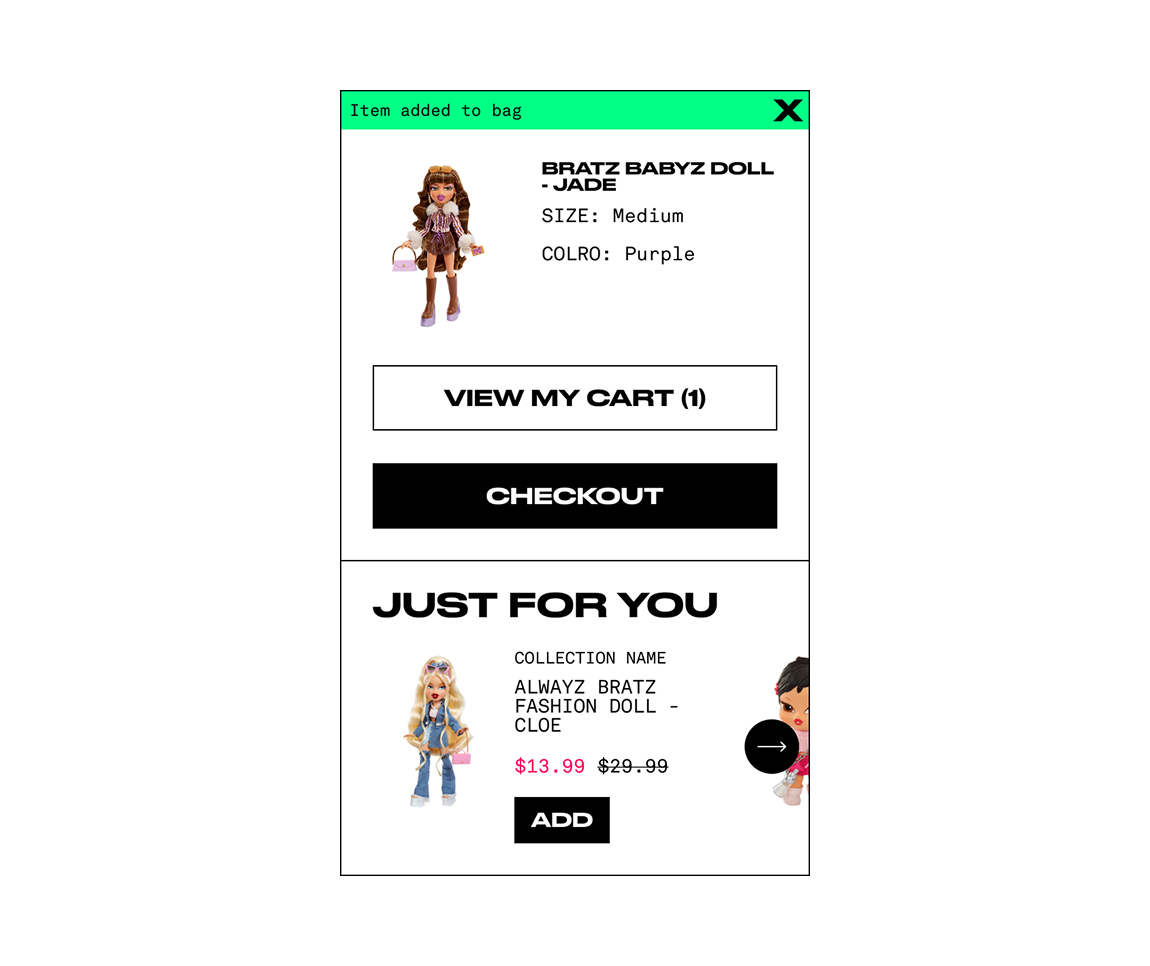
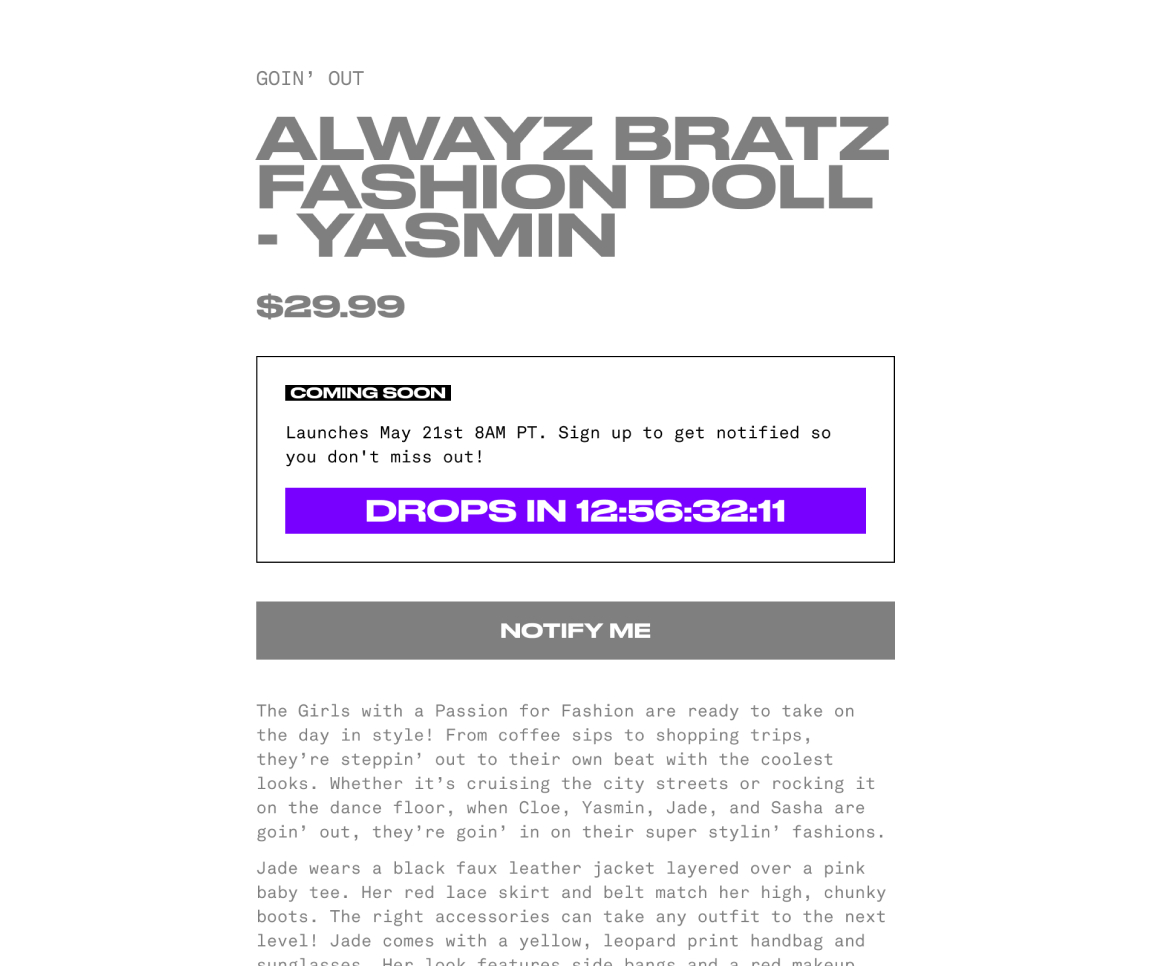
A Smarter “Coming Soon” Experience
Challenge
Bratz regularly releases limited edition drops that generate a lot of demand, but the existing product pages did not support that kind of moment. There was no clear way to build anticipation, capture early interest, or communicate when a product would actually go live.
Solution
We created a custom “Coming Soon” product template with a countdown, early access email capture, and flexible messaging. It ties directly into Shopify’s product status, making it easy for the team to manage and update.
Benefit
The experience builds excitement ahead of launch while giving customers a clear understanding of when products will be available. It also helps grow a high intent email list before the drop.
Results
Stronger engagement leading up to launch, with more customers signing up and showing up ready to purchase when products go live.
Y2K Energy, Shopify 2.0 Engine
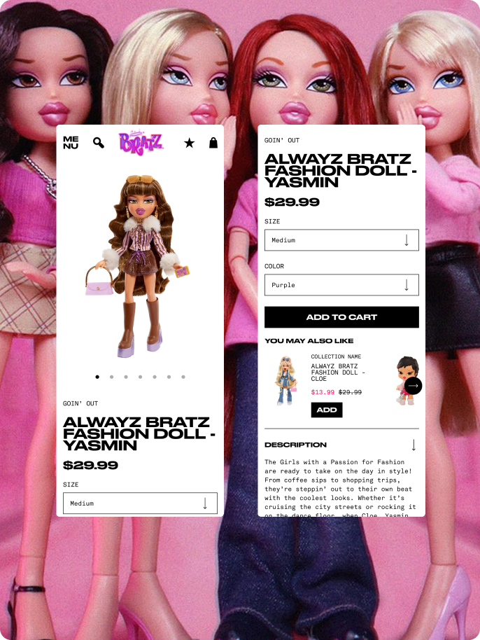
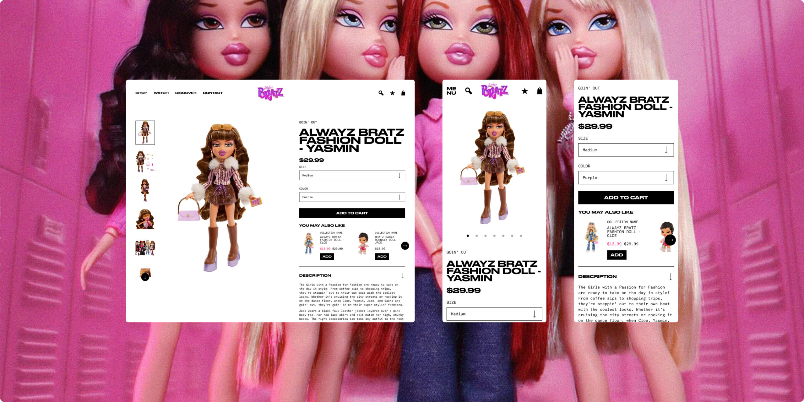
The Bratz team came to us with a bold homepage concept. Y2K attitude, hyper saturated color, and strong editorial energy. Our job was to take that direction and carry it through the rest of the Shopify experience: PDPs, collection pages, cart, checkout, account, search, blog, and everything in between.
Using Shopify 2.0’s flexible theme architecture, we built a system that kept the Bratz visual identity sharp and consistent across every screen, interaction, and device.
Business Impact
- Clean typographic hierarchy that scales as the catalog grows
- Visual merchandising patterns built for large product grids
- Responsive scaling and accessibility baked in
- A consistent layout language from homepage through checkout
The Power Of Collaboration
Working with the Bratz and MGA teams was fast moving and highly collaborative. They came in with a strong creative direction, and there was clear alignment from the start, which made decision making a lot more straightforward.
There was a steady back and forth between teams throughout, with quick feedback and a shared focus on getting things right. That made it possible to push the experience further while still keeping everything grounded and practical.
The Result
Conversion Performance
Improvements to product pages, clearer calls to action, and a more intuitive cart experience made it easier for customers to complete their purchases.
Average Order Value
Stronger upsell moments and better cart incentives encouraged customers to add more to their orders.
Site Performance
Moving to Shopify 2.0 improved overall site speed, especially across mobile and collection browsing, creating a smoother experience from start to finish.
The Conclusion
This went beyond a simple refresh. The Bratz site was reworked to better support how the brand shows up today, from more flexible merchandising and improved UX to a design that feels true to its identity.
The result is a site that not only looks right for the brand, but works harder behind the scenes, making it easier for customers to browse, discover, and buy.