Start Here
- The difference between a store that converts and one that does not often comes down to details most brands overlook: load speed, product page clarity, and checkout confidence
- Mobile UX accounts for the majority of traffic but converts far lower than desktop. Closing that gap is the biggest opportunity for most Shopify stores.
- Small changes like sticky add-to-cart buttons, clearer size guides, and visible shipping info can lift conversion rates without touching the overall design
The difference between a Shopify store that converts and one that does not usually is not the design. It is the details. Load speed, product page clarity, checkout confidence, and how well the store works on a phone. These are the things that turn someone who is browsing into someone who buys.
We build and optimize Shopify stores for a living, and the pattern is always the same. The stores that convert well are not necessarily the most visually impressive. They are the ones where nothing gets in the way of the purchase.
Product Pages That Do the Selling
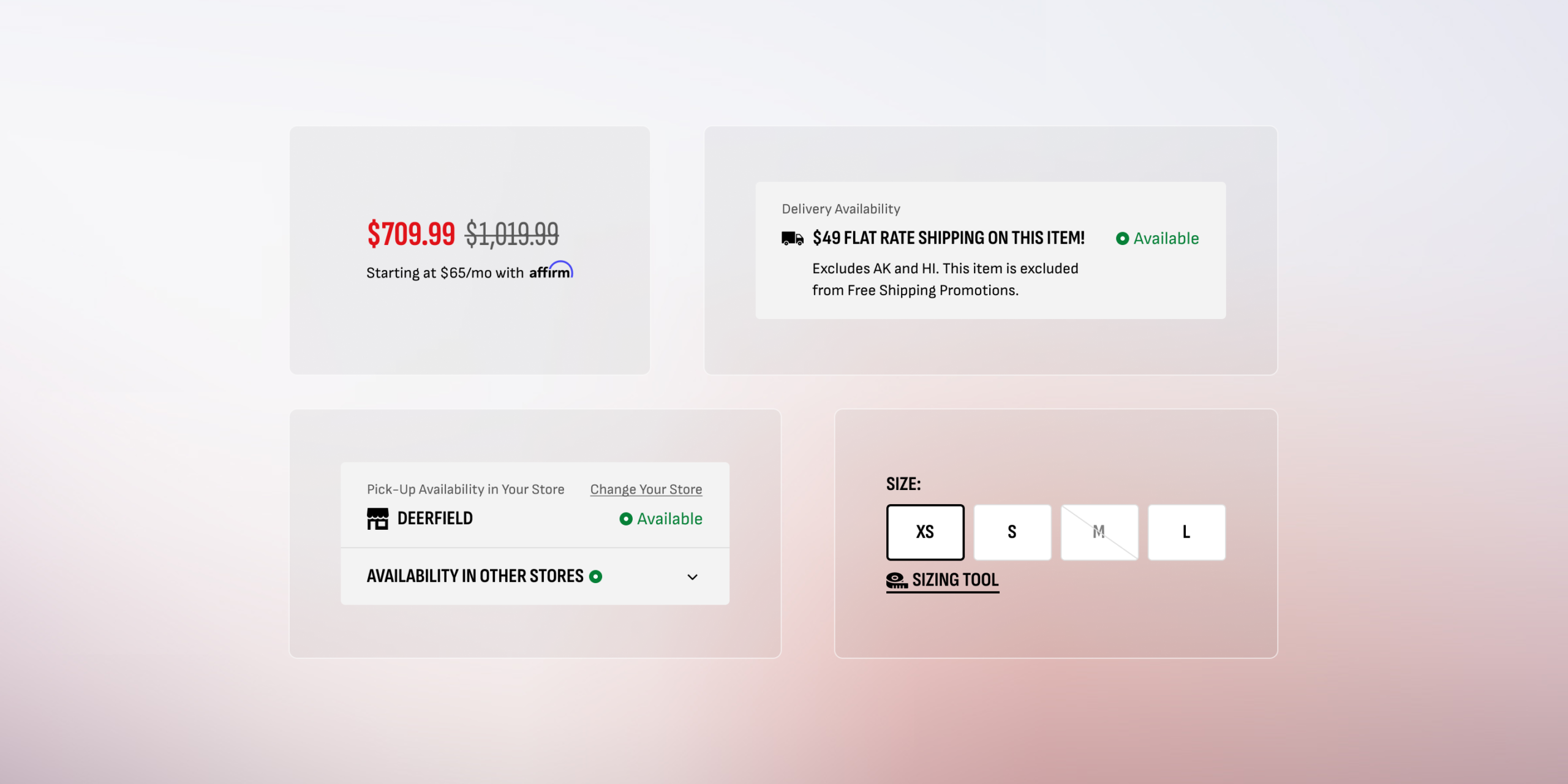
A product page has one job: give the shopper enough information and confidence to add the item to their cart. That means clear product photography from multiple angles, a description that answers real questions (not just marketing copy), visible pricing with no surprises, and accurate availability. If any of those are missing or hard to find, you lose people.
Size guides are a good example. Apparel and footwear stores that display clear, easy to read sizing information directly on the product page see fewer returns and higher conversion. Burying the size chart behind a tiny link that opens a hard-to-read popup is a small detail that costs real money.
Mobile Experience Is the Whole Experience
With mobile devices driving roughly 78% of ecommerce site traffic, your store’s mobile experience is not a secondary concern. It is the primary experience for most of your shoppers. Yet mobile conversion rates still lag desktop significantly across the industry.
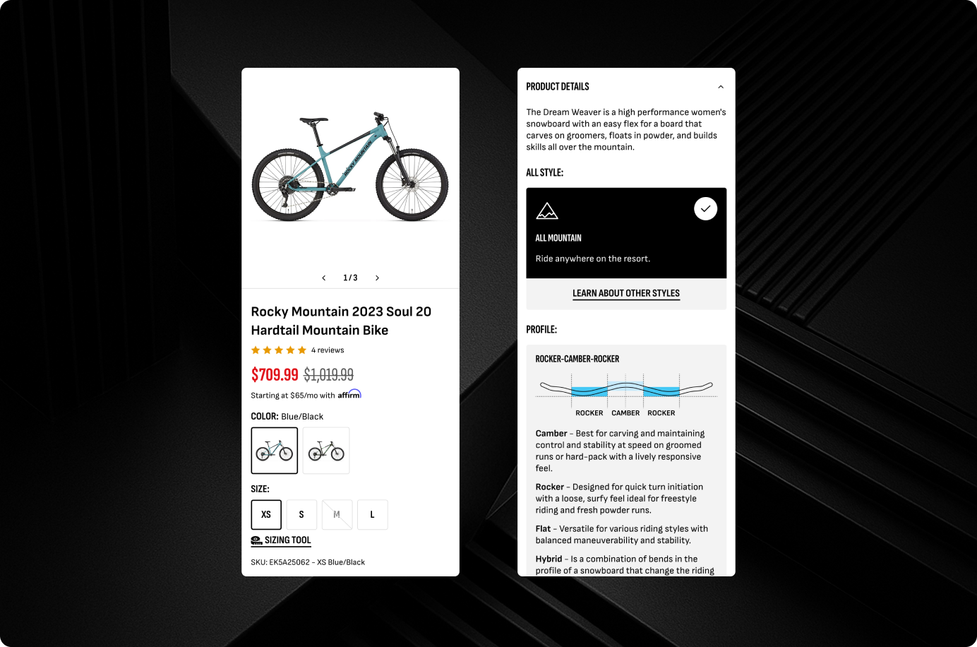
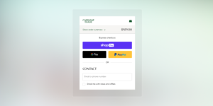
The fixes are usually specific and practical. Sticky add-to-cart buttons that stay visible as the shopper scrolls. Collapsible product details that keep the page scannable without hiding information. Touch-friendly variant selectors that do not require precise tapping. Accelerated checkout options like Shop Pay and Apple Pay presented prominently. Each one of these is a small change that reduces friction on mobile.
Checkout Confidence
The checkout page is where most abandoned carts happen. Unexpected costs are the single biggest reason shoppers leave. Showing estimated shipping costs on the product page or cart page, before checkout, removes that surprise. Clear return policy language, recognizable payment badges, and a progress indicator showing how many steps remain all contribute to a shopper feeling confident enough to complete their purchase.
Details Compound
None of these changes are dramatic on their own. But together, they compound. A store that loads fast, has clear product pages, works well on mobile, and makes checkout feel safe converts noticeably better than one that is missing even two or three of these elements. At port80, we focus on these details because they are where the revenue actually lives.
We’ve Done This Before

Carriage Trade
Boutique Shopify transformation with appointment scheduling, loyalty incentives, and concierge-grade luxury retail UX.
View Case Study
Surplus City
Shopify Plus 2.0 migration with streamlined inventory, modernized UX, and scalable operations for a liquidation retailer.
View Case Study
The Boardroom
High-performance Shopify 2.0 migration with editorial design and culture-driven UX for a premium action sports retailer.
View Case StudyWondering why your products aren’t ranking?
We help Shopify brands fix the technical issues that keep product pages out of Google search results.