Save Yourself a Scroll
- The average Shopify store converts around 1.4% of visitors. Top performers hit 4.7% or higher. The gap is mostly UX.
- Fixing mobile checkout friction, simplifying navigation, and adding trust signals are the highest impact changes for most stores
- You do not need a full redesign to see results. Targeted UX improvements on key pages often pay for themselves within weeks
Small UX changes on a Shopify store can drive significant revenue gains without a full redesign. The average Shopify conversion rate sits around 1.4%, while the top 10% of stores convert at 4.7% or higher. That gap is not explained by product quality or pricing alone. It is almost always a UX gap.
We work on Shopify stores every day, and the pattern is consistent. Brands come to us thinking they need a complete rebuild. Most of the time, they need five or six targeted fixes on their highest traffic pages.
The Changes That Actually Move the Needle
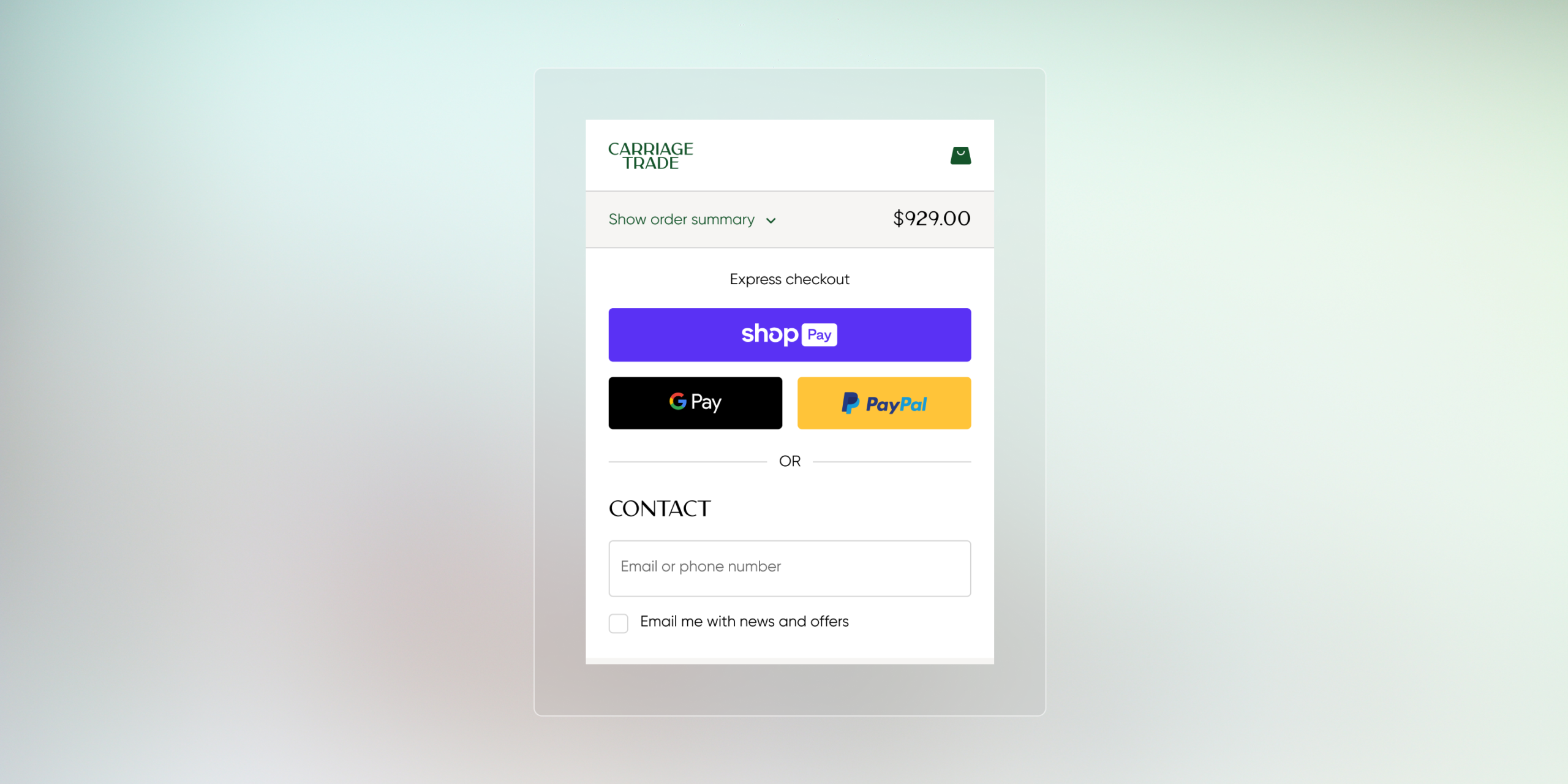
Mobile checkout friction is the biggest revenue leak we see. Smartphones account for roughly 78% of retail site visits globally, but mobile conversion rates consistently lag desktop by 40% or more. The reason is usually small things: buttons too close together, form fields that require zooming, payment options buried below the fold. Enabling Shop Pay or Apple Pay as a primary checkout option removes multiple steps and makes a noticeable difference.
Navigation clarity is the second highest impact area. If shoppers cannot find what they are looking for within a few seconds, they leave. We have seen stores pick up meaningful conversion improvements just by restructuring their collection pages around how people actually shop rather than how the brand organizes inventory internally.
Trust Signals That Convert Skeptics
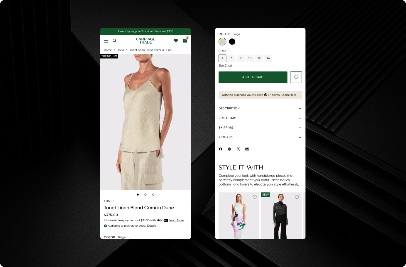
Trust is a UX issue, not just a branding issue. Showing real customer reviews on product pages, displaying clear return policies above the fold, and using recognizable payment badges all reduce hesitation at the point of purchase. These are not big design changes, but they directly affect whether someone hits the buy button or bounces.
Cart abandonment rates across ecommerce average around 70%. A significant chunk of that abandonment comes from uncertainty: unexpected shipping costs, unclear return policies, or a checkout that feels unfamiliar. Fixing those moments does not require new features. It requires better placement of information the shopper already needs.
You Do Not Need a Redesign. You Need a Sharper Store.
A full site redesign can take months and cost tens of thousands of dollars. Targeted UX improvements on your product pages, cart, and checkout can be implemented in days and often generate returns within weeks. The key is knowing which changes matter most for your specific store, your traffic patterns, and your customer behavior.
At port80, we start most CRO engagements with an audit of the pages that get the most traffic and the highest drop-off. That tells us exactly where the friction is and which fixes will have the biggest impact on revenue.
We’ve Done This Before

Hudson Grace
Magento to Shopify 2.0 migration with subscription purchasing, store pickup, and optimized performance for a premium retailer.
View Case Study
The Boardroom
High-performance Shopify 2.0 migration with editorial design and culture-driven UX for a premium action sports retailer.
View Case Study
Surplus City
Shopify Plus 2.0 migration with streamlined inventory, modernized UX, and scalable operations for a liquidation retailer.
View Case StudyThink your store is leaving money on the table?
We audit Shopify stores to find the UX issues that are costing you conversions. No guesswork, just data.